WHAT WE WERE ASKED
The original request was for a brochure to replace the current one. But once we had completed a brand audit of all the marketing material, we decided that although the &Beyond logo could remain the same, the visual identity needed a refresh before we could design a brochure. It was heavy, masculine and did not feel like a luxury brand. It needed to feel more refined and luxurious while communicating the brand ethos and better showcasing the lodges and destinations.
WHAT WE DID
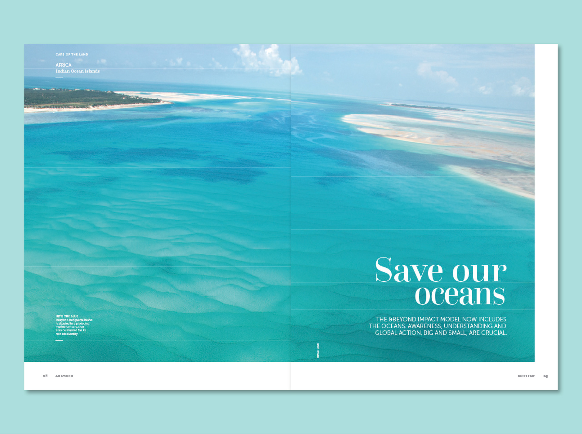
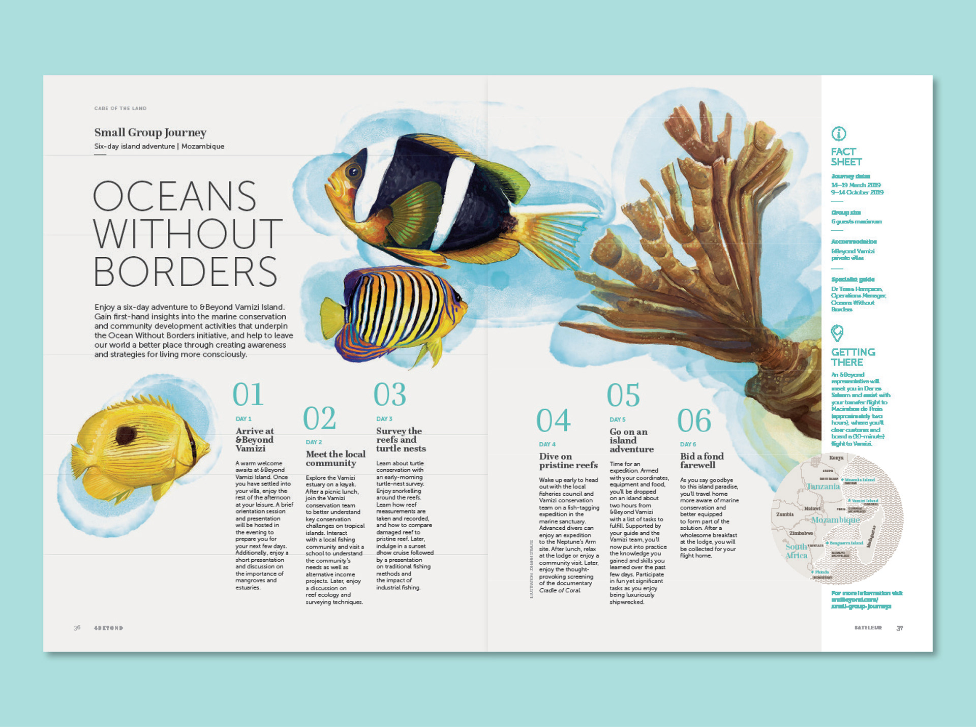
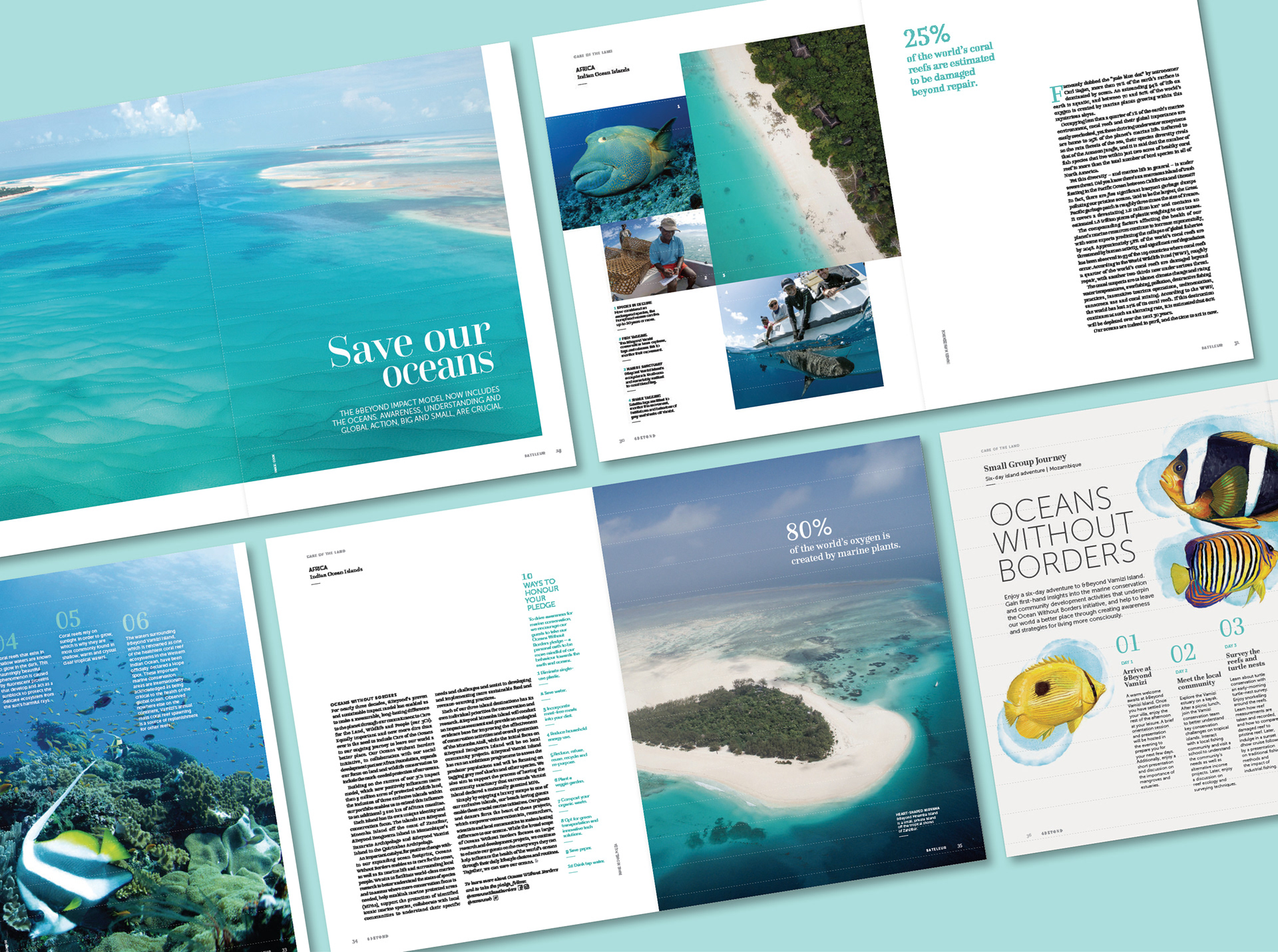
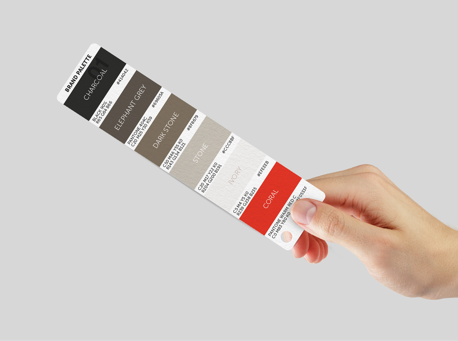
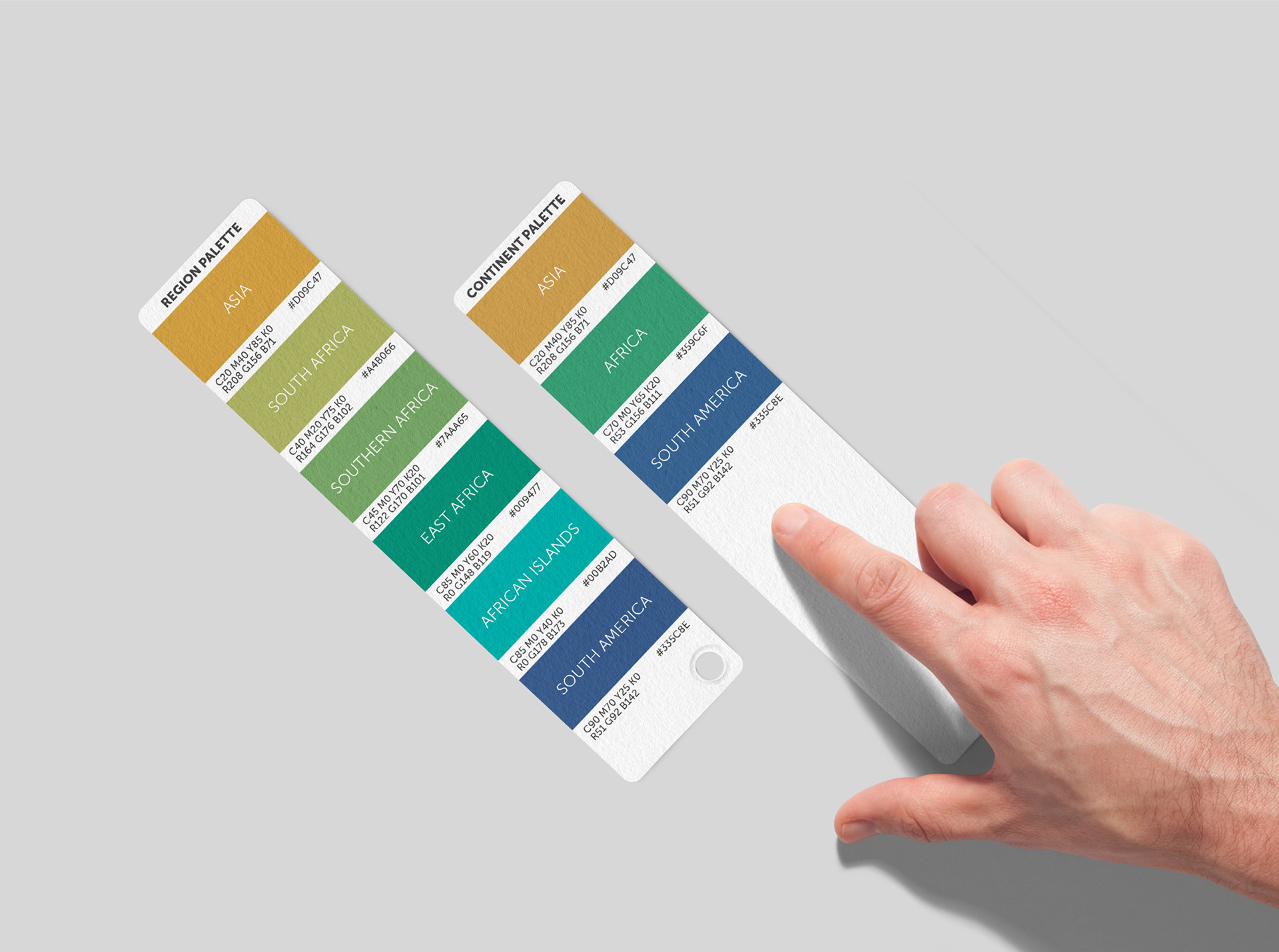
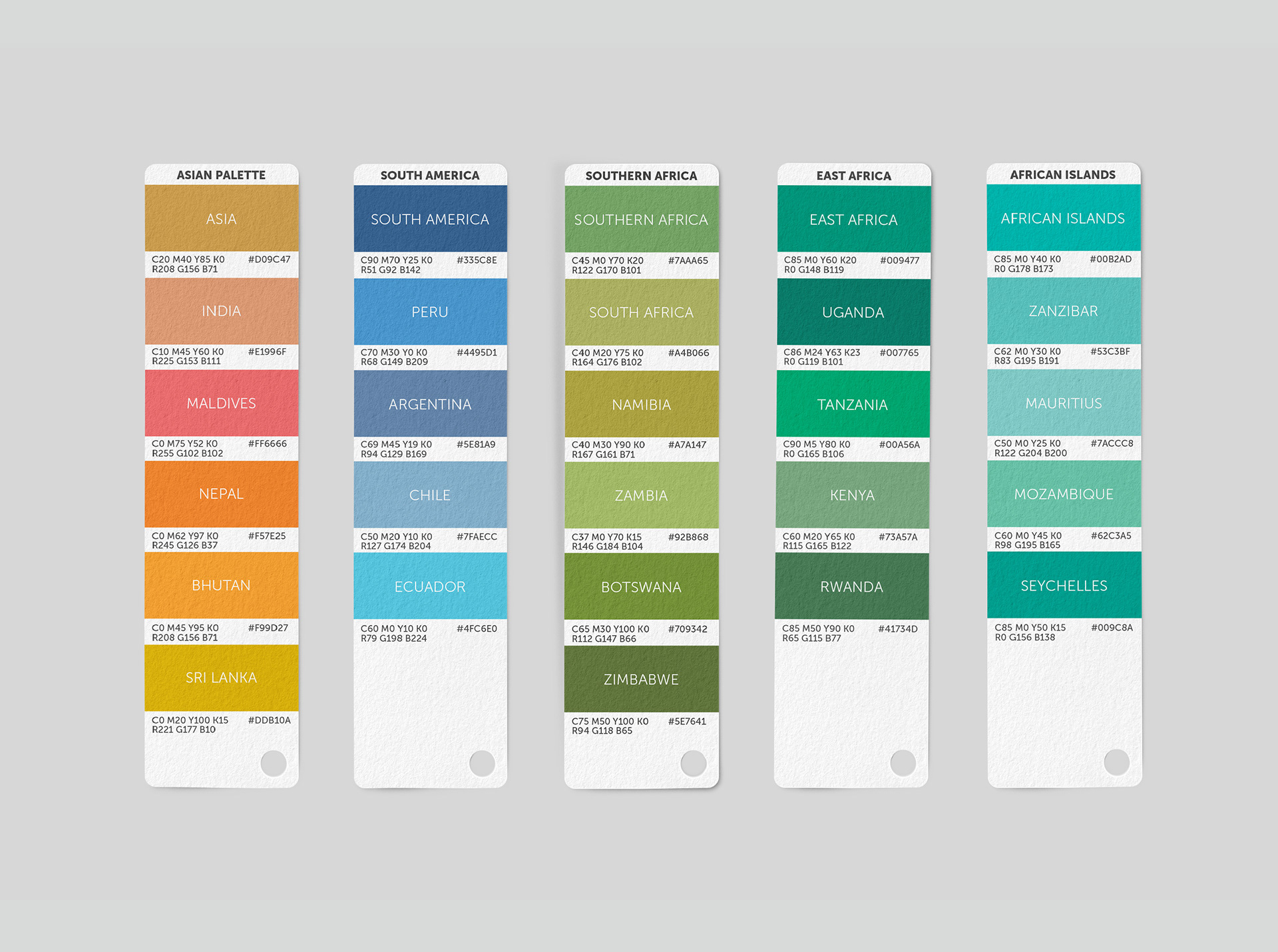
The brand stretched across 3 continents with 29 owned lodges and many more under the &Beyond name. We developed the brand architecture to include lodges, regions, destinations, and projects such as Oceans Without Borders. We then refined the existing colour palette to create a destination-specific colour system that could be added to in a logical way in the future.
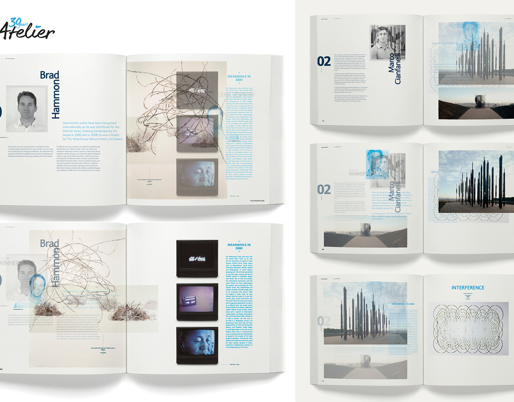
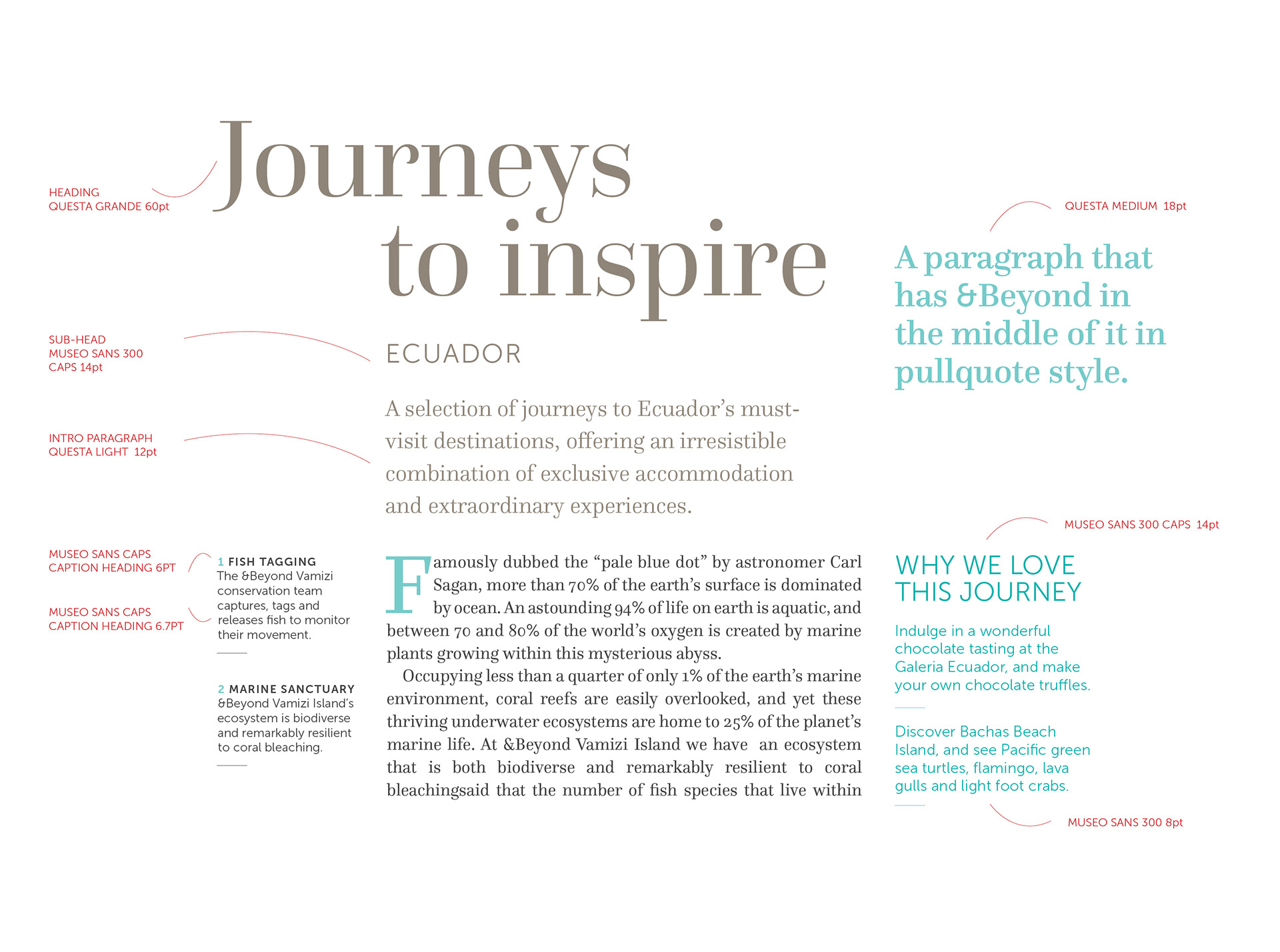
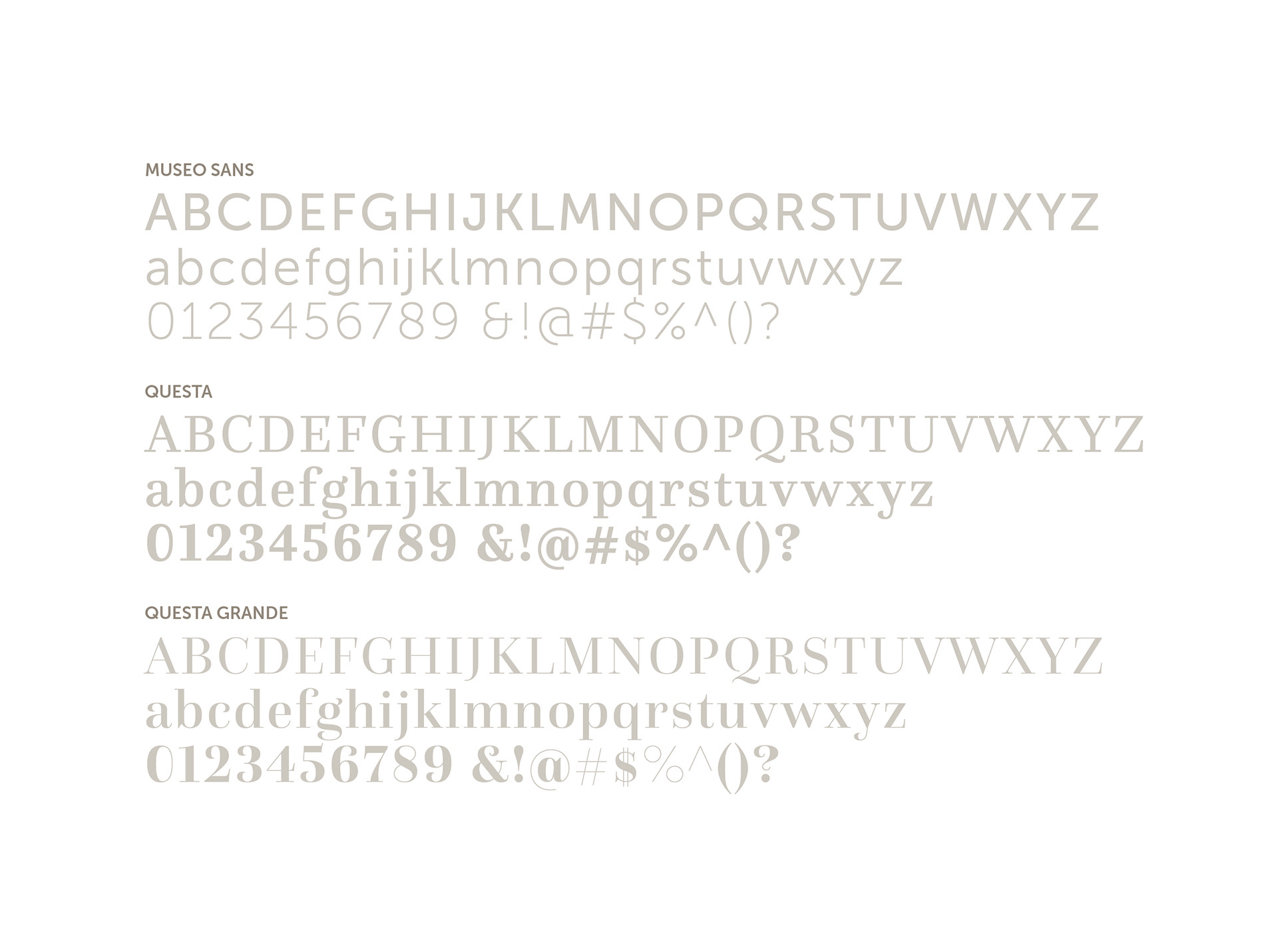
Typography in the existing brand did not convey luxury and had several hierarchy issues that needed to be resolved. We selected the Questa family of serif fonts, Questa Grande and Questa, to bring depth, grandeur and a sense of occasion to the brand. Questa Sans balanced out the serif fonts and allowed further options for elegant typography.
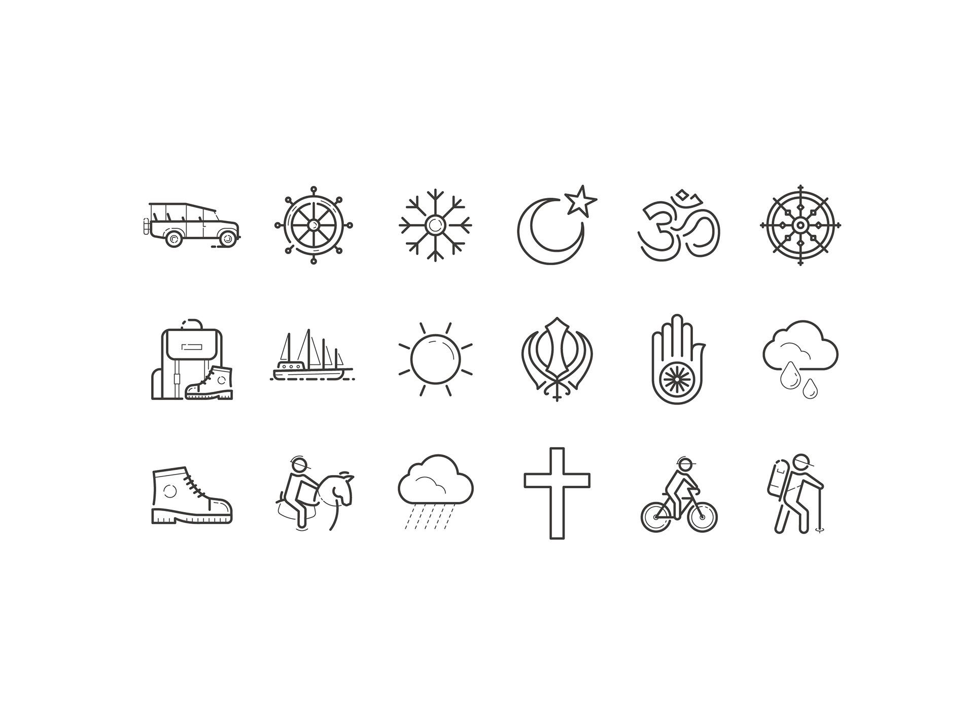
We developed custom pictogram iconography in two different line weights to suit the typographic layout style.
These were used extensively on the website and in printed marketing material.
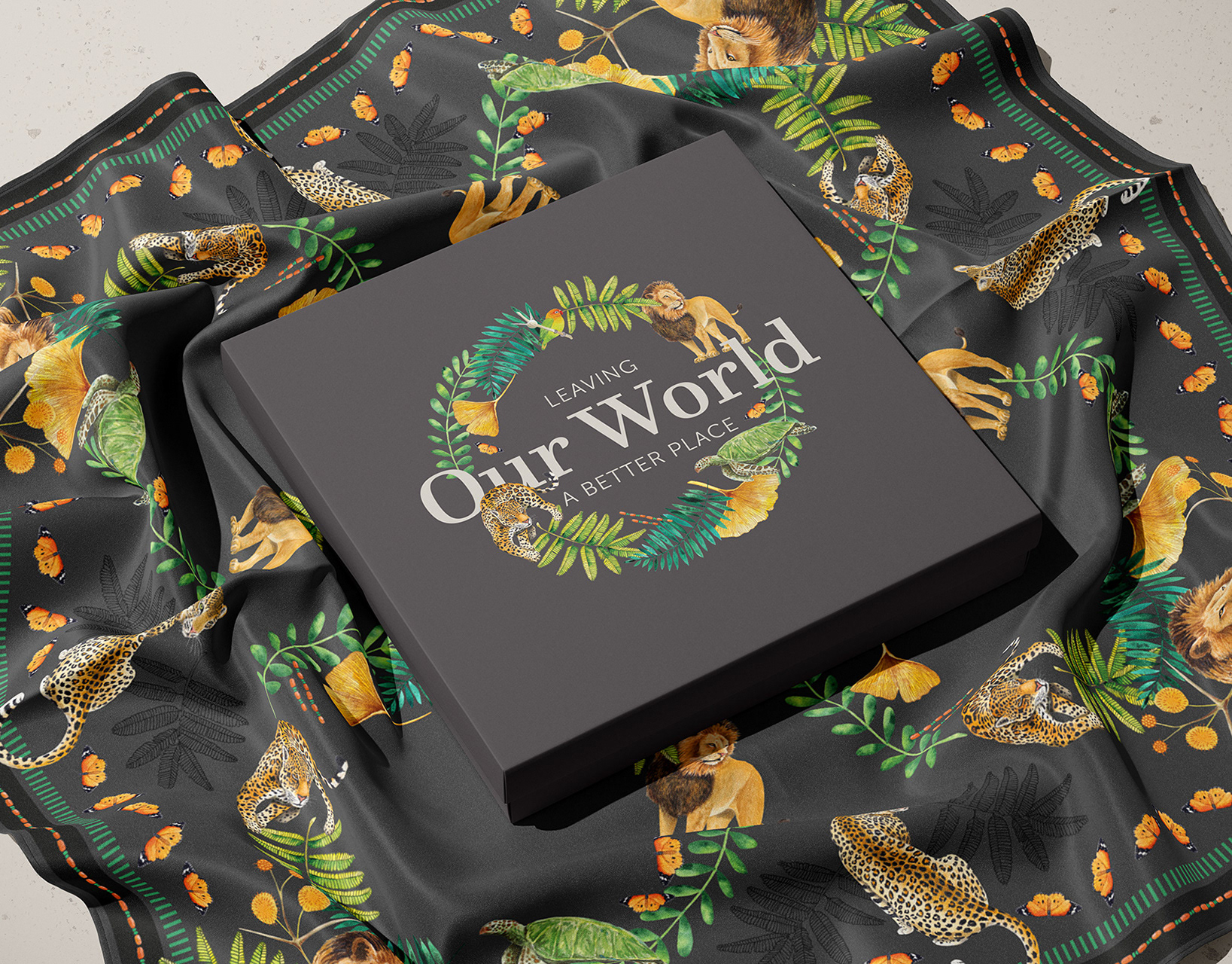
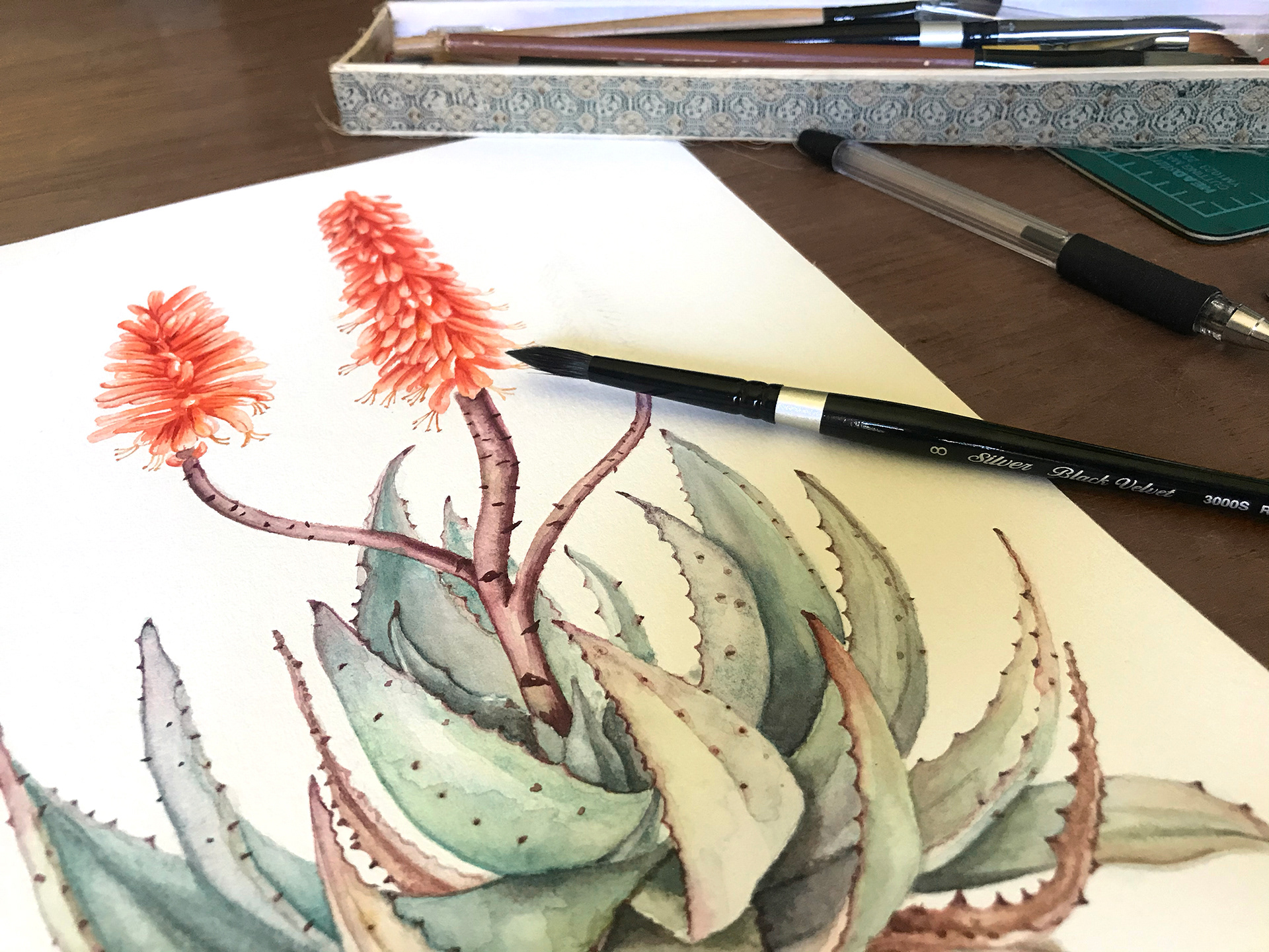
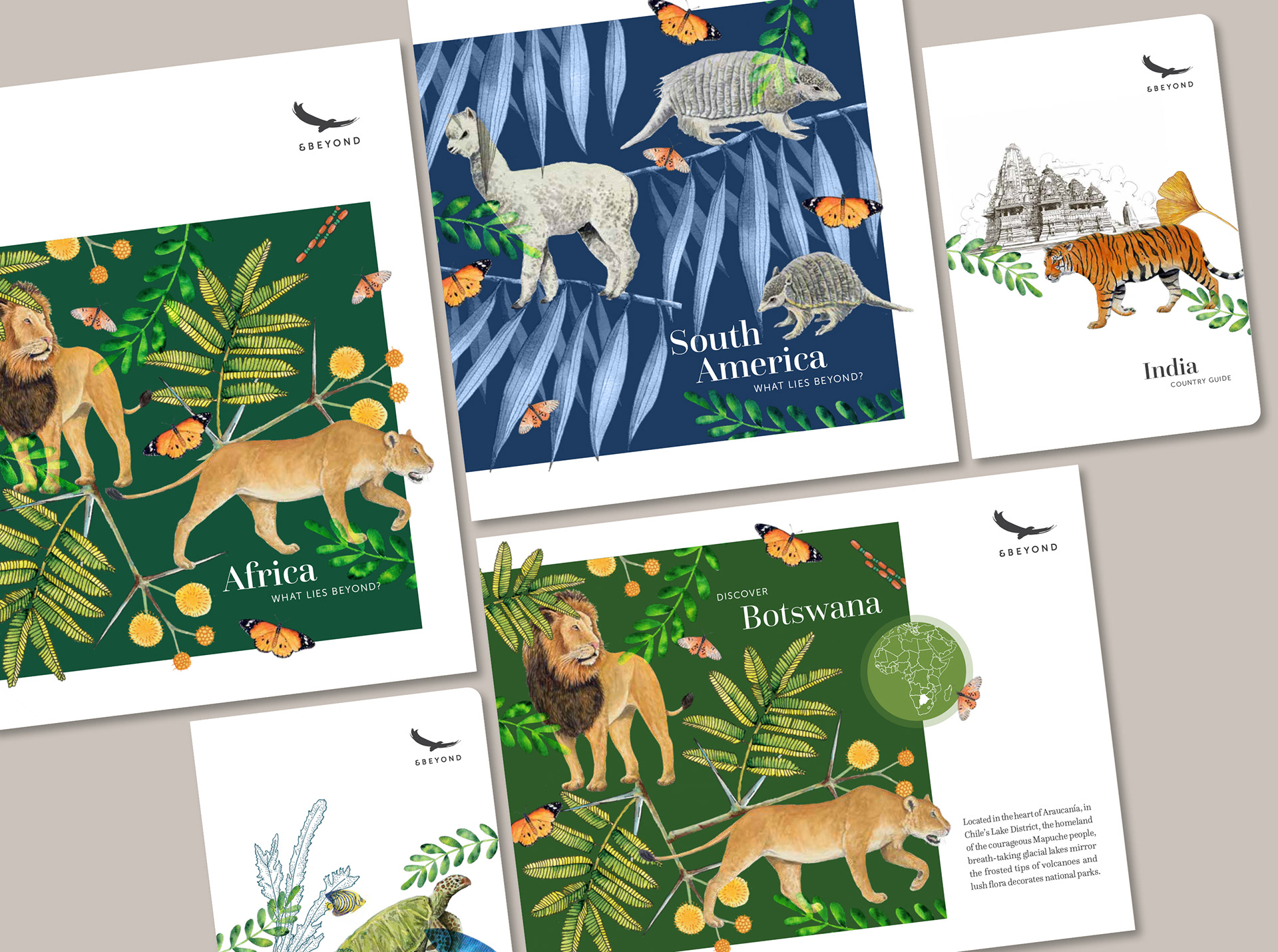
Taking inspiration from the brand's existing field guide illustrations, we developed an illustrative visual language, using intricately layered watercolour and linework fauna and flora, for use throughout the brand.
The range of illustrations spanned Land, Wildlife, People, Africa, Asia and South America.
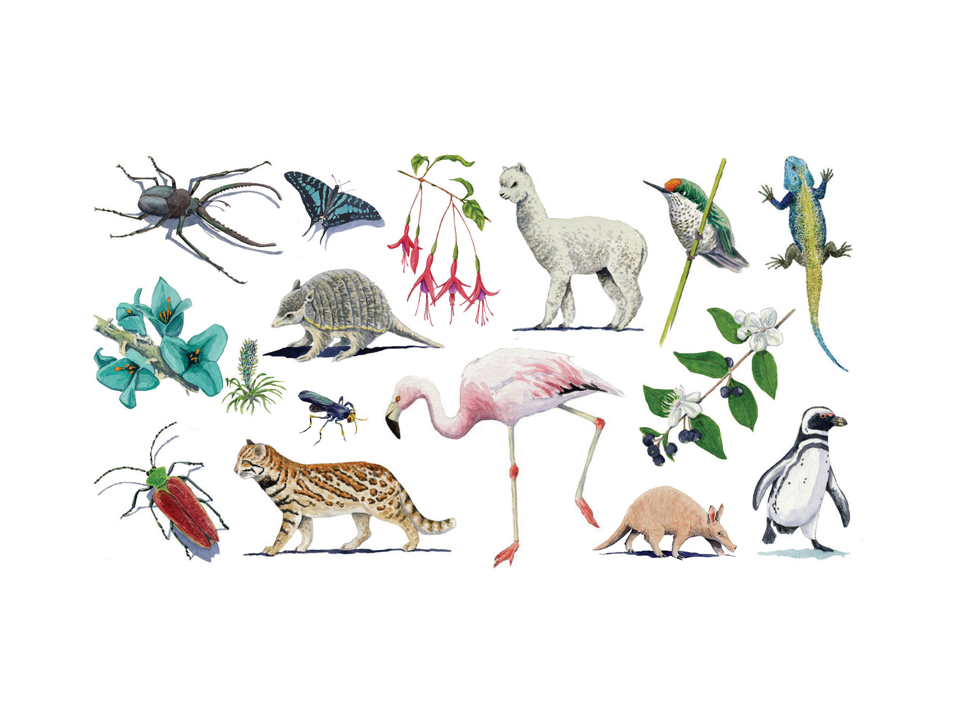
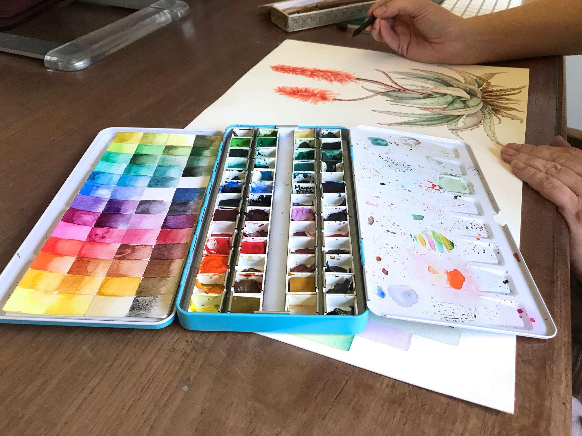
For each application, we combined a set of relevant illustrations in a highly considered way for both the destination as well as the medium.
From loose, minimal groupings on white for field guides to denser collages on dark backgrounds for brochure covers and light backgrounds for wallpaper, the destination's fauna, flora and colour palette were key to the final result.
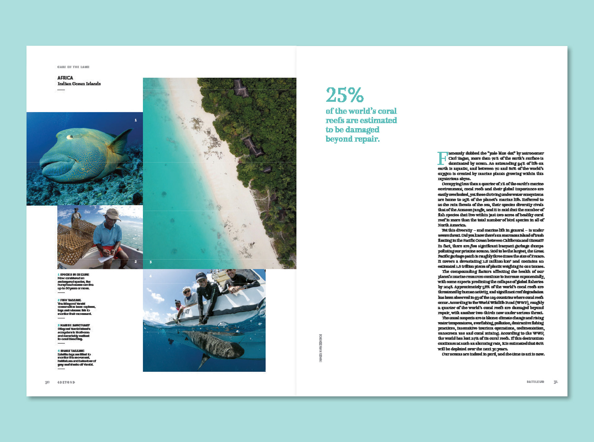
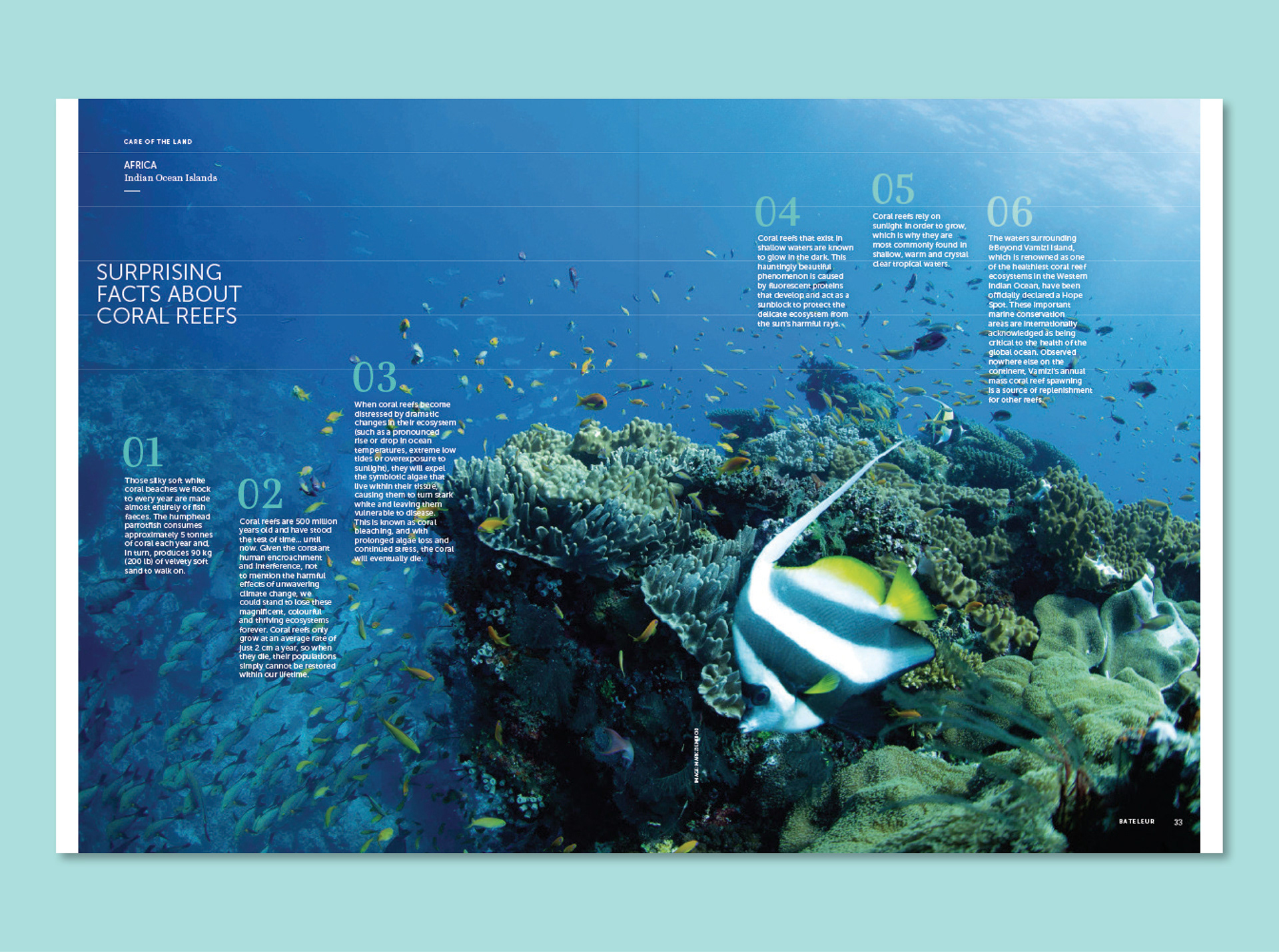
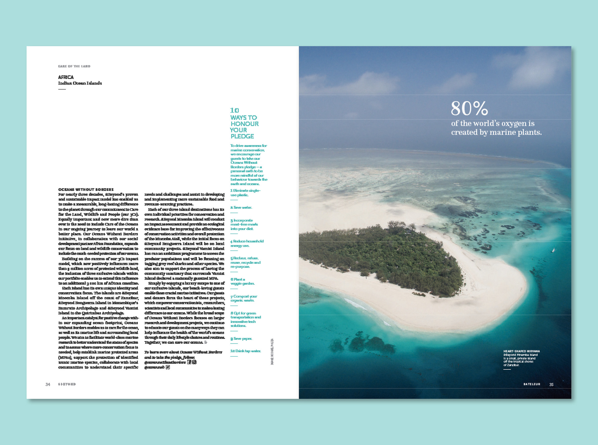
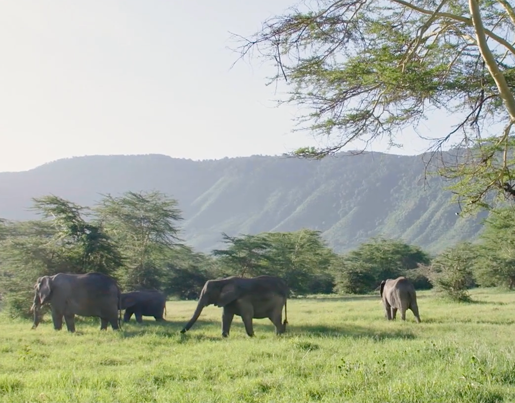
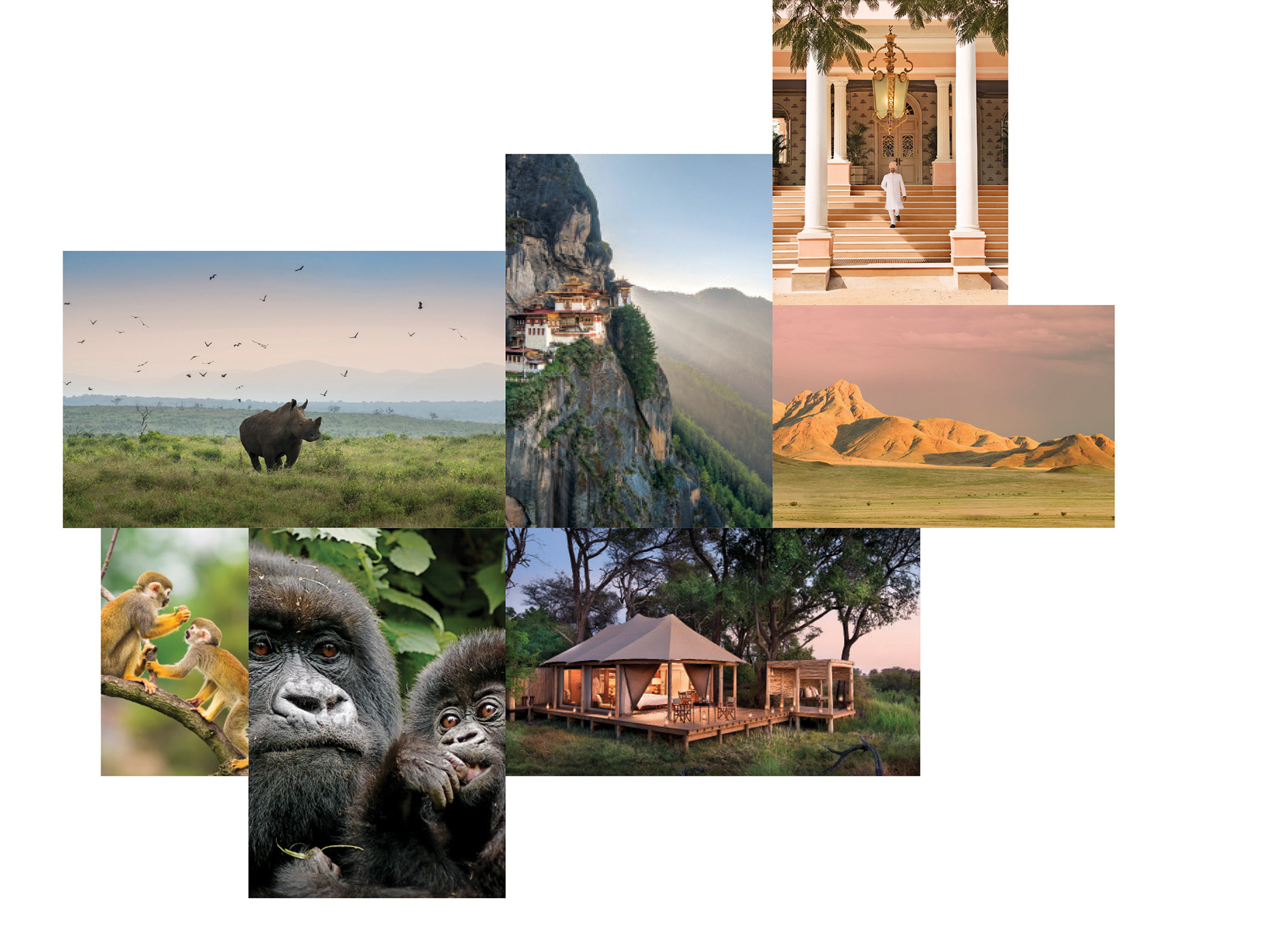
The brand already owned a gorgeous selection of photography collected over the years from amazing photographers.
We developed a photography layout style that accommodated both small groups of images in a dynamic collage layout and large-scale images that made use of interesting crops and placement.
When all the brand elements are thoughtfully combined in the layout style of the brand it creates a magical sense of place, a truly luxury feel and a really clear hierarchy of information.