the problem
User Issues & Budget Constraints
With the original Blockkoin Exchange app there were several user issues. Ease of use, legibility, consistency and hierarchy of information needed to be addressed. The revised app needed to align with the newly developed visual identity and personality but an extremely limited budget only allowed for a reskin with minor copy edits.
the solution
A Hard Working Interface Design
The UI had to work hard to solve as many user issues as possible within the constraints. I took the approach of removing superfluous information while increasing the legibility and hierarchy of information through layout, typography and colour choices. Illustration, bespoke iconography and consistent crypto icons elevated the app while improving brand recognition and ease of use.

COLOUR PALETTE

TYPOGRAPHY
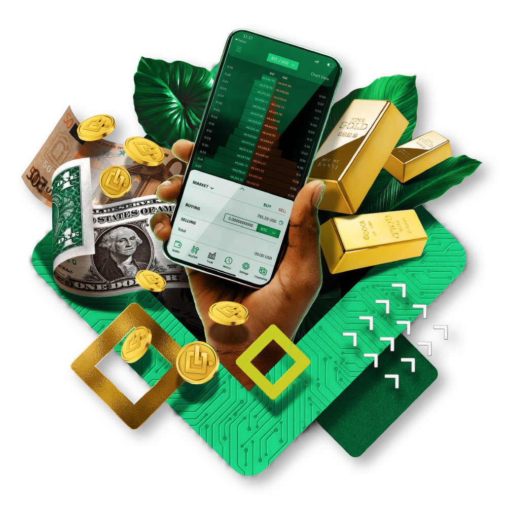
ILLUSTRATION
ICONOGRAPHY
DESIGN DECISIONS
Before & Afters
These before and afters best demonstrate some of the decisions we made in re-skinning the Blockkoin Exchange App to solve user issues through smart interface decisions.
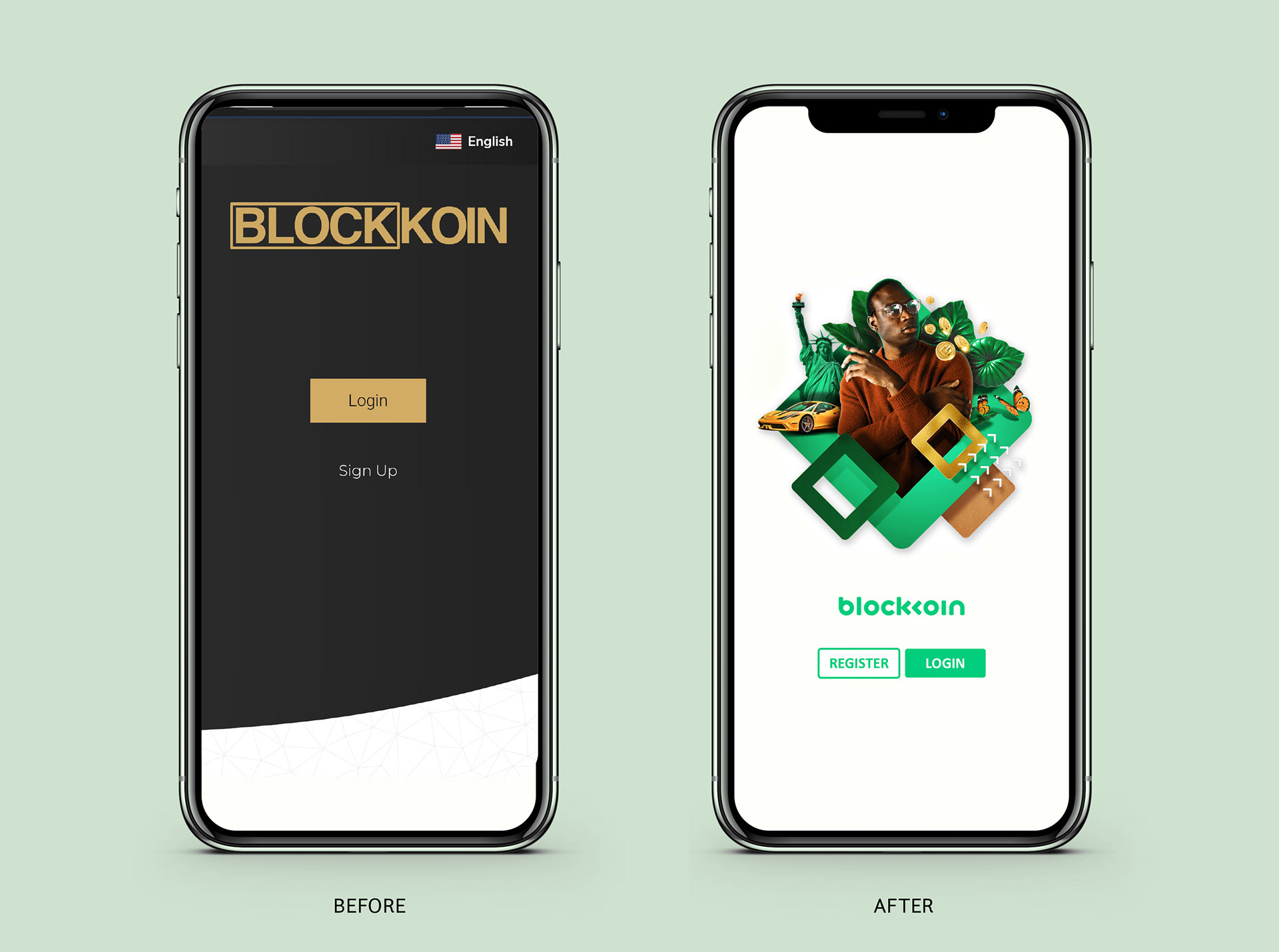
Home Screen
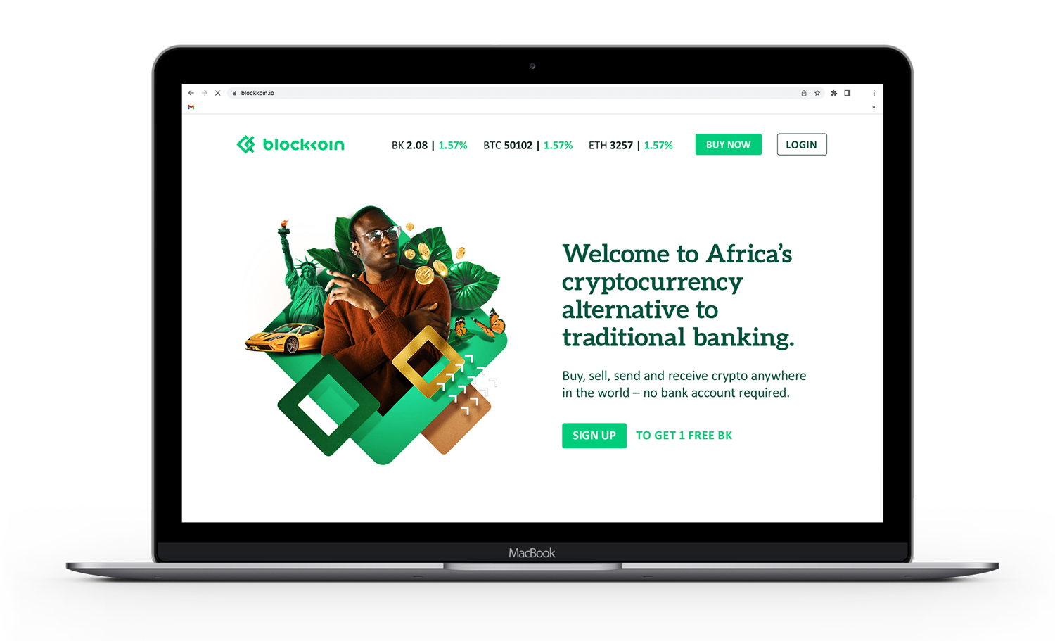
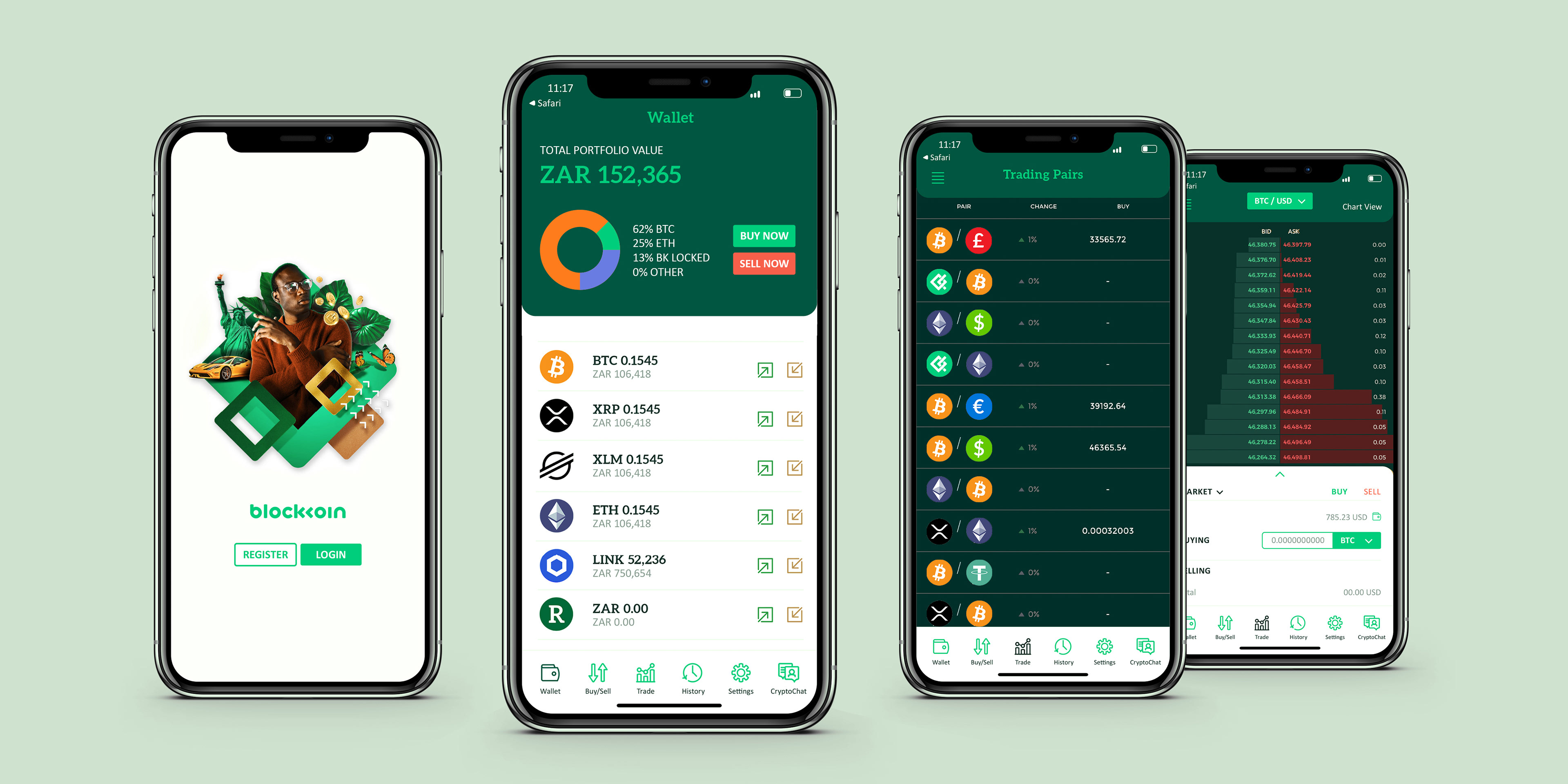
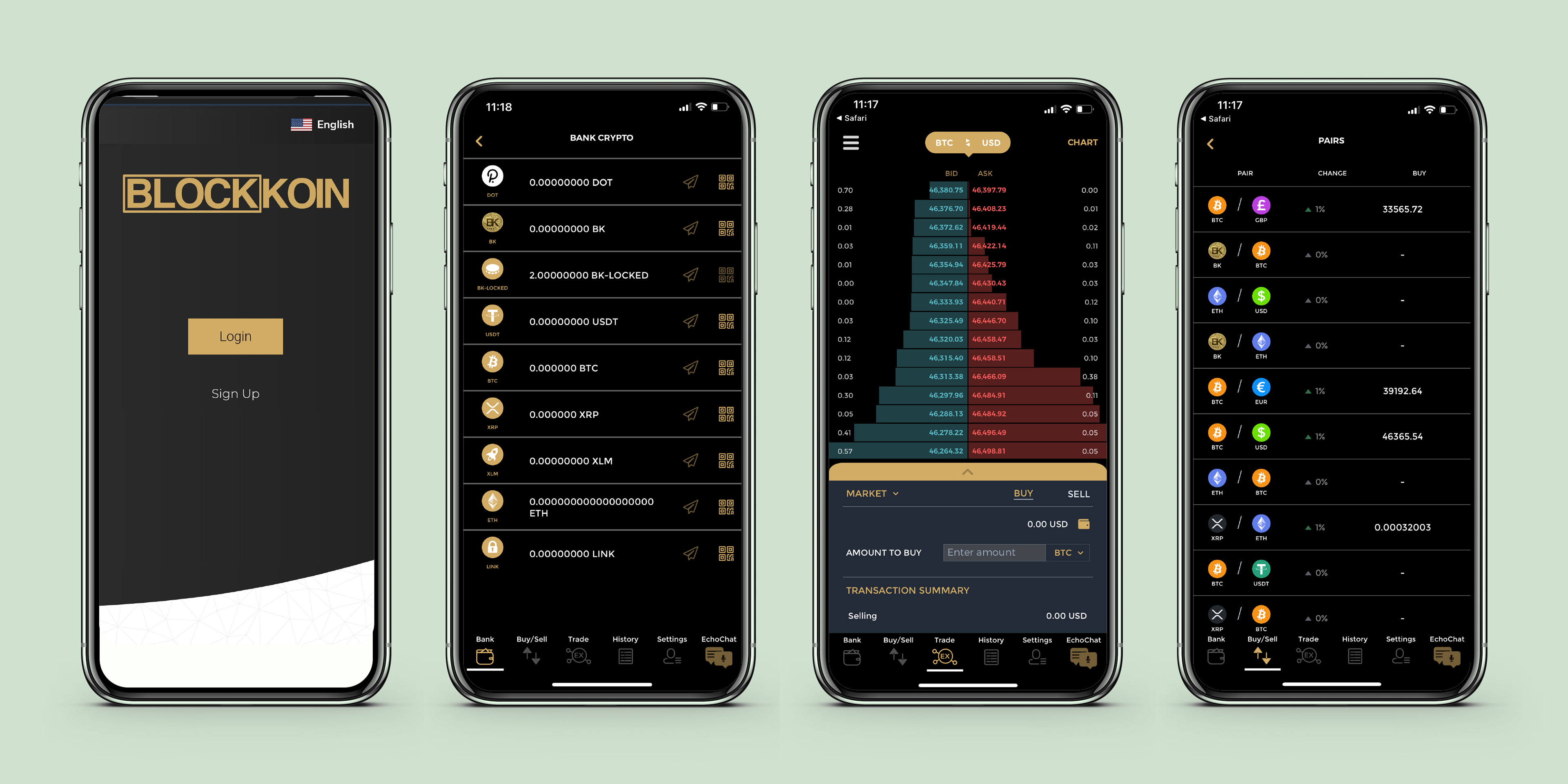
The original login screen was dark, unwelcoming and lacked personality. I incorporated the collage illustration style on a background of fresh white to increase the emotive and aspirational aspect of the page.
Logotype remained small while two clear buttons, differentiated through solid and outline options, denoted the choice to either register or log in.
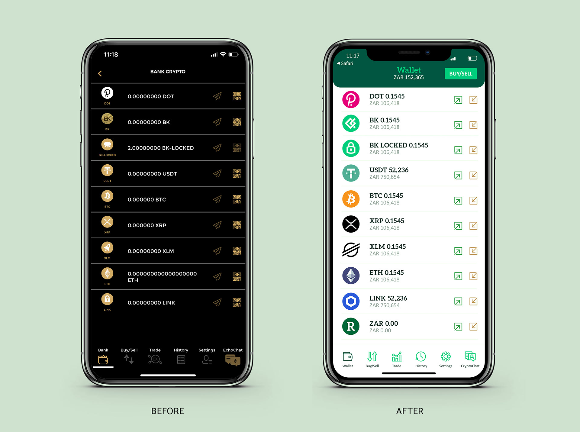
Wallet Screen
A dark green tab was added to the top of each screen which contained the page name and a more detailed description. In this case, we used the name 'Wallet', as it is commonly known in the industry, and included the total portfolio balance in the user's native currency below the heading.
To encourage trading a buy/sell button was added to the right of this header section.
In the list of currencies icons were redesigned to be larger and in the respective brand's colours to aid in faster recognition. To the right, the name of the token appeared with the amount held by the user. Below this, the value of each token appeared in the user's native currency. Text and icons were enlarged without sacrificing any real estate.

Exchange Trading Screen
The green tab contained the trading pair with a dropdown menu to change it. To the right were graph viewing options.
Edits were made to the wording in the buy/sell area as well as changes to the heading fonts and colours to make the transaction options clearer.
Overall, the trade pop-up in white, with text in dark green, green and grey provided high accessibility and functionality.
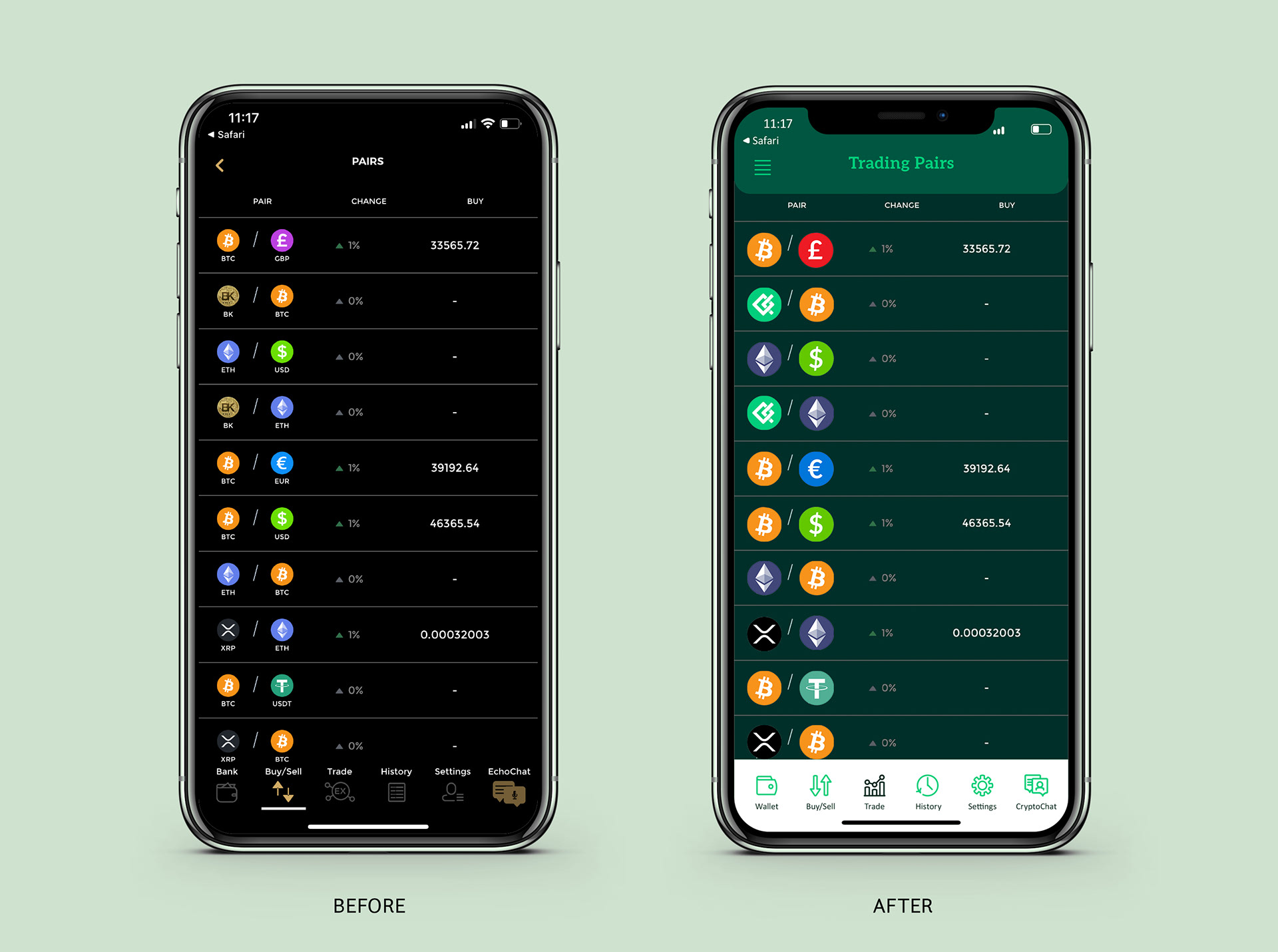
Trading Pairs Screen
The green tab contained the trading pair with a dropdown menu to change it. To the right were graph viewing options.
The 'dark view' is shown here where the background is a very dark green allowing the top green tab to still stand out as well as darker icons such as XRP.
Currency icons were redesigned to be both larger and in the respective brand's colours to aid in faster recognition, especially between trading pairs.
The brand had a successful relaunch to the market after which work commenced on the second iteration.
second iteration
Further Development
A new 'visual' wallet made the wallet page easier to read at a glance.
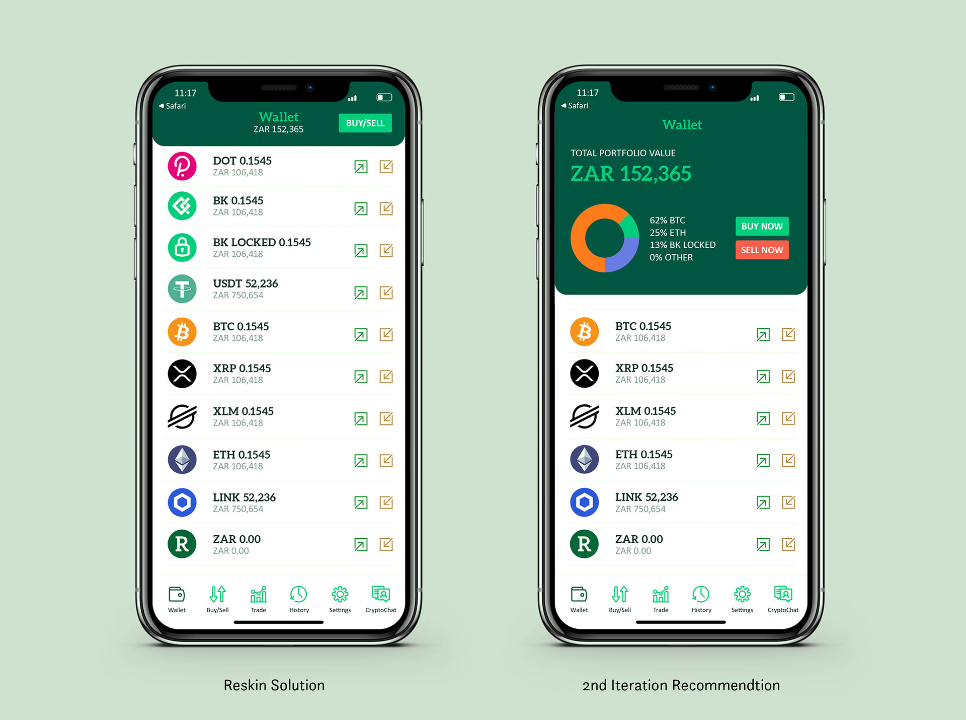
A New Wallet Screen
With a robust brand established and the launch behind us, we were able to look at small improvements to the overall app that would require further development budget.
One of the most important changes was the wallet screen. Since cryptocurrency can be difficult to convert and consolidate on your own, I wanted to make the portfolio as visual as possible. I included a doughnut chart where each token would be represented as a percentage of the portfolio in its brand colour giving the user a quick overview. To the right would be a key with the percentage and token. Below the page would keep the improvements made in round one with the token name, quantity and native currency value.
produce
Digital Applications
In addition to the mobile app, templates for social media, a single-page website and a web-based cryptocurrency exchange were also designed.