SCOPE OF WORK
Logo Design
Visual Identity Design
Social Media
Range of Packaging
Sample Promo Mailer
Guideline Book
Event Branding
Merchandise Design
Visual Identity Design
Social Media
Range of Packaging
Sample Promo Mailer
Guideline Book
Event Branding
Merchandise Design
problem
Symrise, a German flavour and fragrance house, was launching a range of spices with a West African flavour profile into Africa. The brand would be called FAFA, From Africa, For Africa. To be successful in the market they had to appeal to the various African target audiences while being authentic to Nigeria from a cultural point of view.
solution
We researched Nigeria, West Africa as a region, and Africa as a whole – from the food eaten to the languages spoken, customs observed, dances celebrated and fabrics woven. Africa is home to brightly coloured textiles – each tribe with its own unique story about the cloth they associate with. We used this rich history as the foundation for a vibrant and engaging brand.
Our Creative Process
ASSESS > STRATEGISE > CREATE > PRODUCE
Creating an authentic and beautiful brand starts with asking the right questions.
Phase 1: ASSESS
In this phase, we made sure that we understood Nigeria as a country, West African food, ingredients and recipes as well as the people and cultures of the region. We researched the current competitors, Knorr and Maggi, from a colour, shelf presence and product point of view.
In this phase, we made sure that we understood Nigeria as a country, West African food, ingredients and recipes as well as the people and cultures of the region. We researched the current competitors, Knorr and Maggi, from a colour, shelf presence and product point of view.
phase 2: STRATEGise
In this phase, we explored the purpose, values, audiences, competitors, personality and positioning of FAFA. We had a clear understanding of how we could align ourselves to the likes of Maggi and Knorr but still be able to be authentically West African and stand out on the shelf.
In this phase, we explored the purpose, values, audiences, competitors, personality and positioning of FAFA. We had a clear understanding of how we could align ourselves to the likes of Maggi and Knorr but still be able to be authentically West African and stand out on the shelf.
Phase 3: CREATE
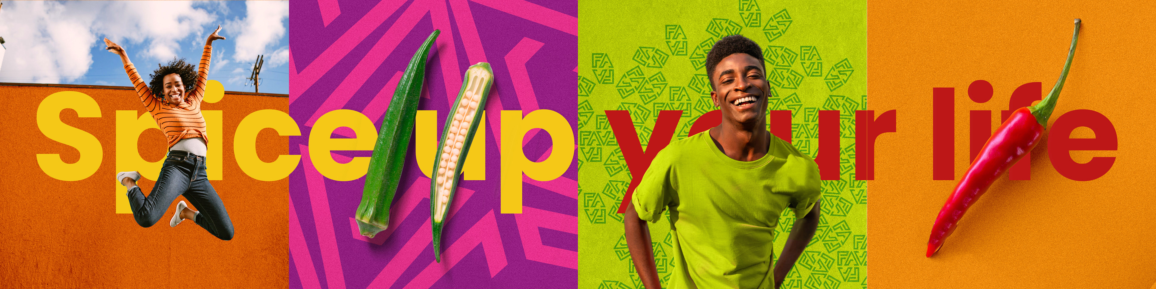
Based on the strategy we created a logo and an appealing, vibrant brand identity. The bespoke logotype felt African and, used as a pattern, created a very West African style that was both relatable and engaging to the target audience. A warm palette of pinks, reds, oranges and greens, custom iconography and photography set the stage for the brand.
Based on the strategy we created a logo and an appealing, vibrant brand identity. The bespoke logotype felt African and, used as a pattern, created a very West African style that was both relatable and engaging to the target audience. A warm palette of pinks, reds, oranges and greens, custom iconography and photography set the stage for the brand.
Phase 4: PRODUCE
With a robust visual brand identity established, we were able to implement the assets and design principles across a variety of print and digital applications with the consistency of messaging, tone and visual identity required. This included packaging, guidelines, social media, samplers, event collateral and promotional merchandise.
With a robust visual brand identity established, we were able to implement the assets and design principles across a variety of print and digital applications with the consistency of messaging, tone and visual identity required. This included packaging, guidelines, social media, samplers, event collateral and promotional merchandise.
CREATE
Logo Development
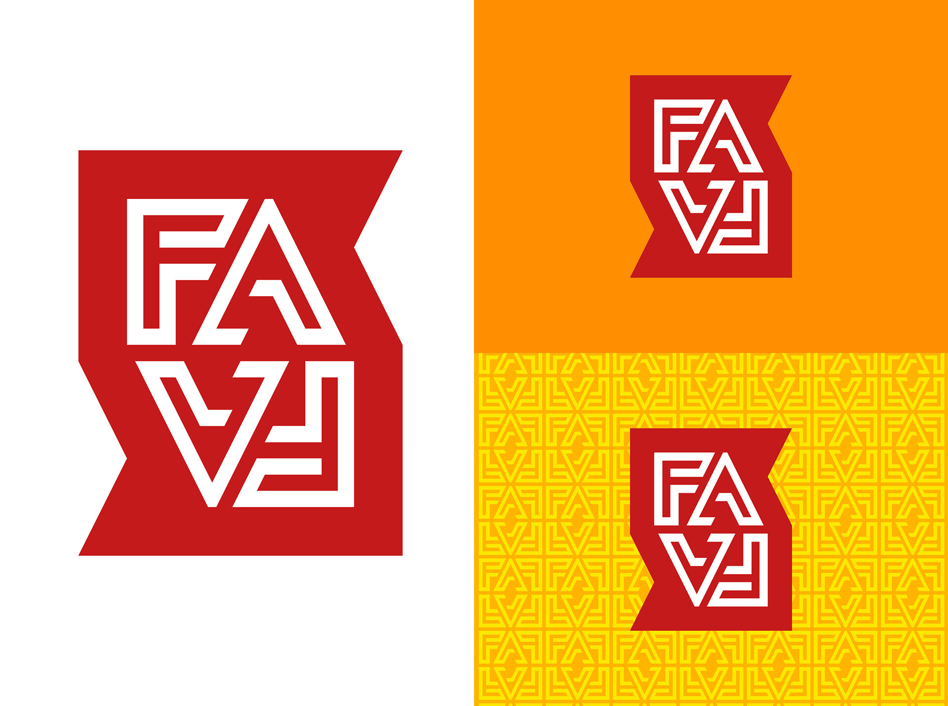
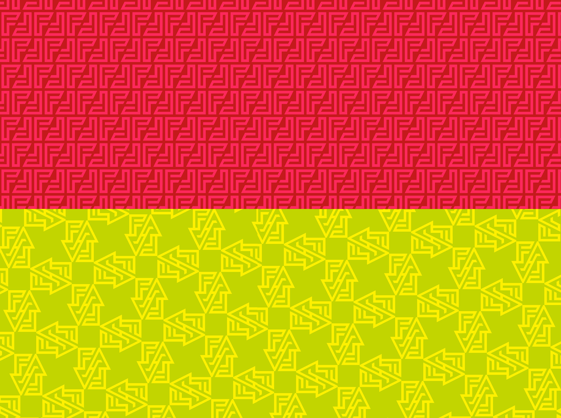
FAFA, with its repeating letters, was ideal to play with in a more creative way. Part of the inspiration for the brand was West African fabrics, particularly a Nigerian indigo print technique that used detailed line work tone on tone. This linework became the format for creating bespoke type for FAFA. The use of repeated positive and negative spaces created a sense of pattern which would later form the basis of the brand's visual identity.
A strong holding shape, based on the stacked letterforms, was created for ease of use on multiple backgrounds. Symrise Red was used as the holding shape colour to bring in the parent brand in a consistent way.
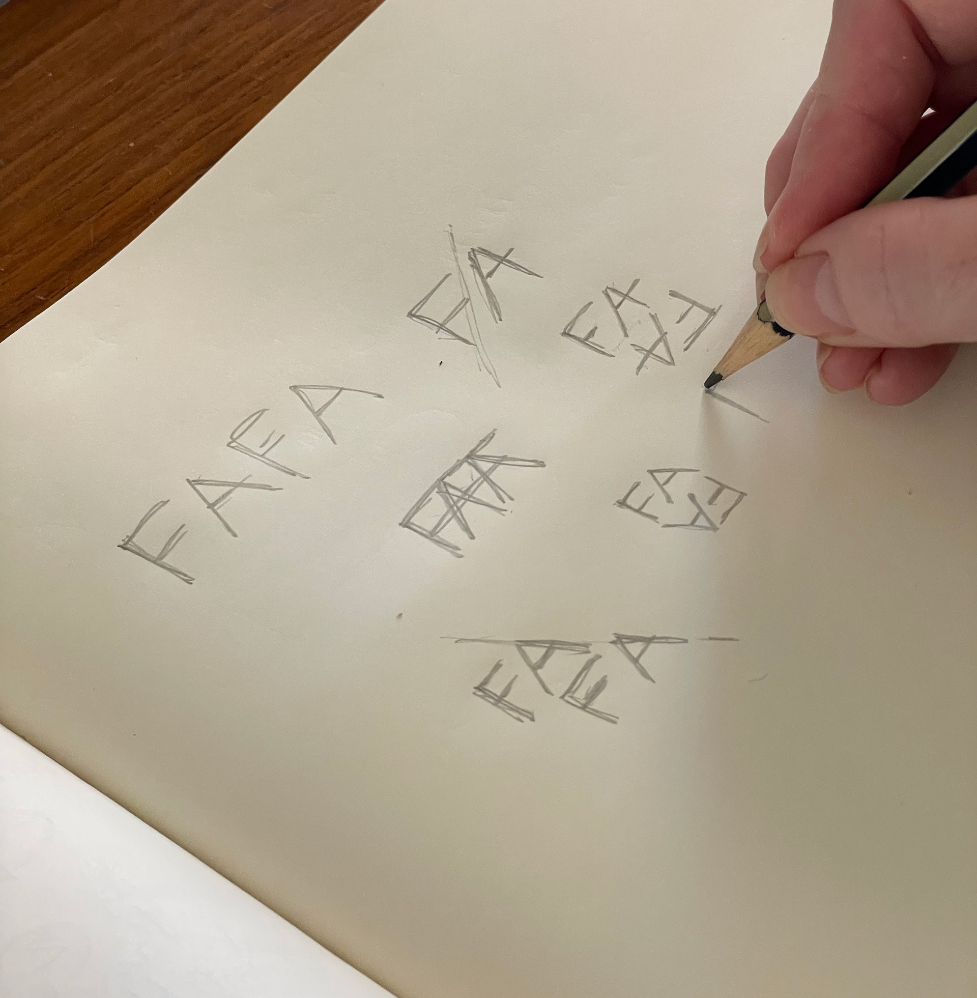
every bespoke logo starts by sketching ideas
CREATE
Visual Identity
Symrise, a flavour and fragrance giant in Germany, had developed a range of West African spices based on traditional West African foods. A total of eight spices had been developed and would need packaging that stood out on shelves in the African market but also felt familiar within the space. We used Symrise dark red as the common colour for packaging and the brandmark itself.
The closest competitors were Knorr and Maggi both using Red, Yellow and Green as the main colours.
We used a colour palette inspired by Waxprint and Kente cloth fabrics from the region as well as a tone-on-tone pattern approach that was used in traditional Nigerian indigo cloth.
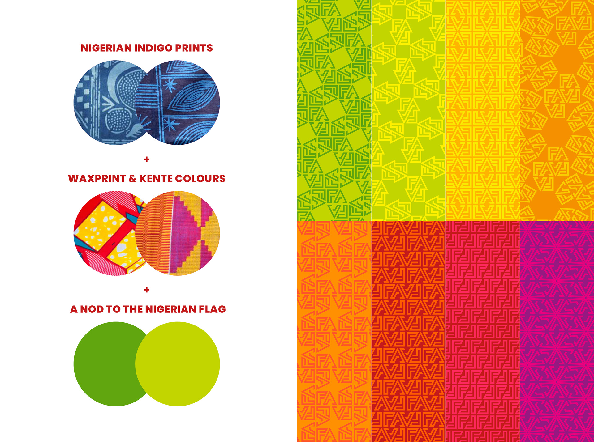
Colour palette Inspiration
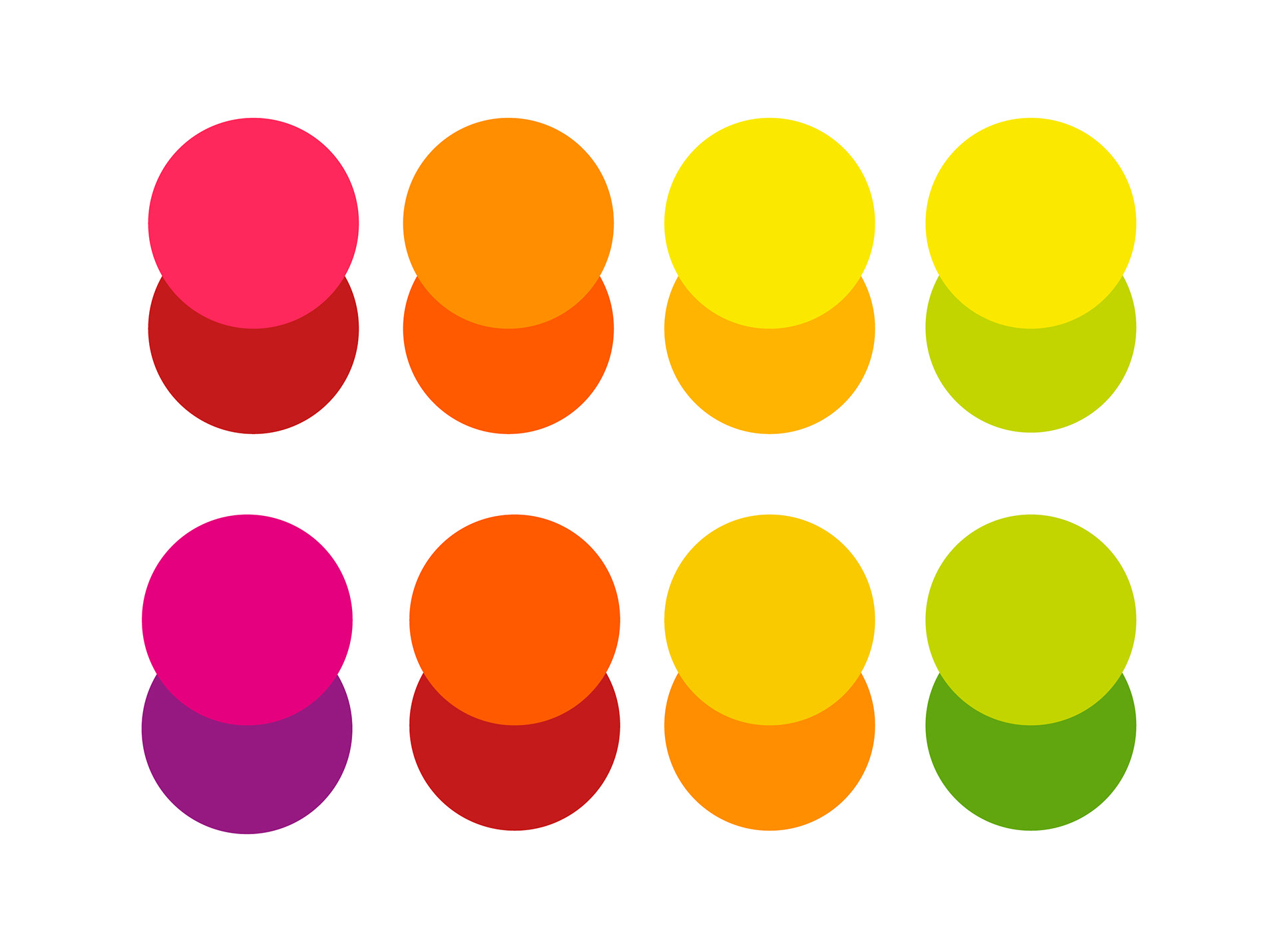
colour palette
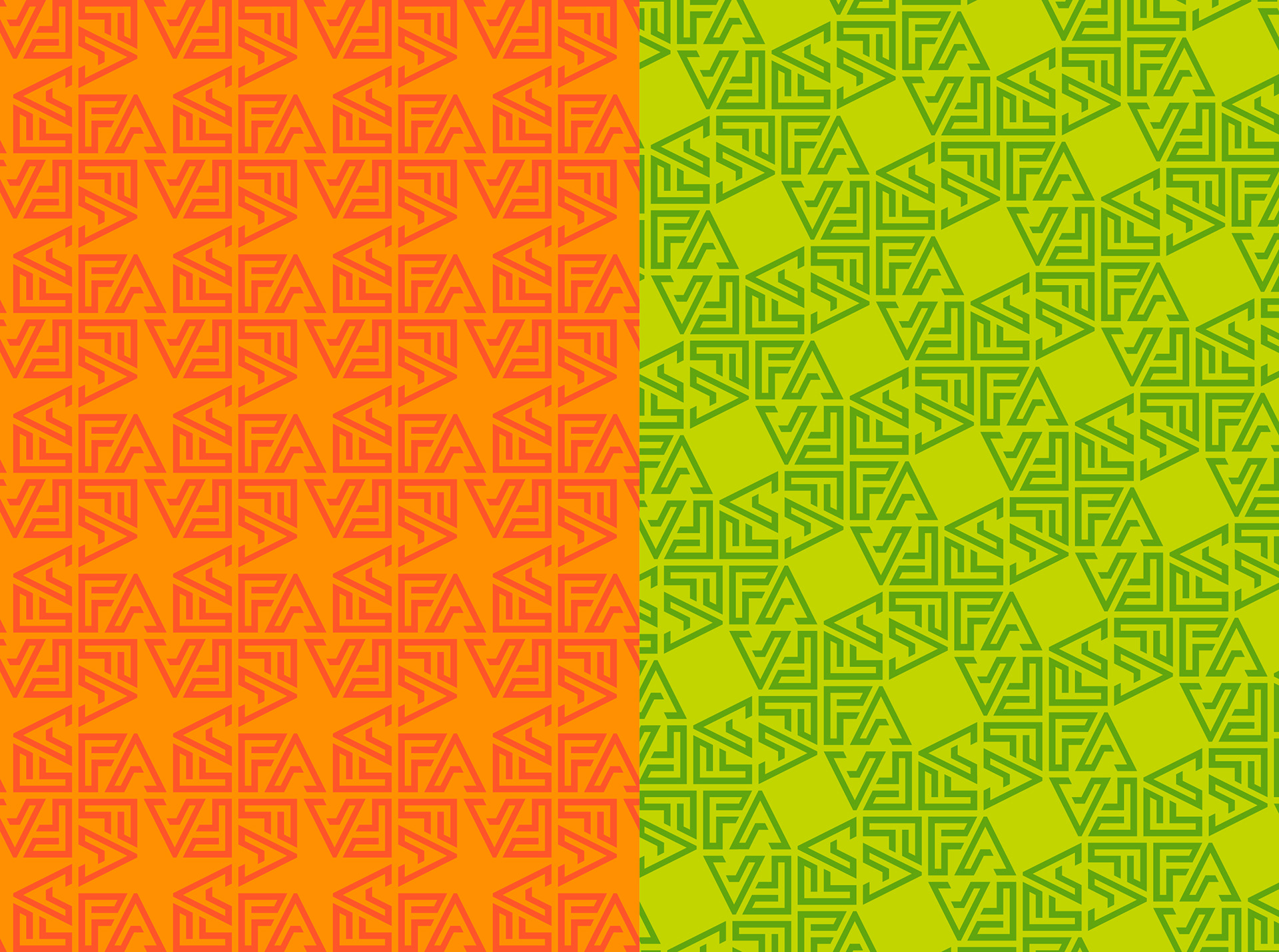
pattern development
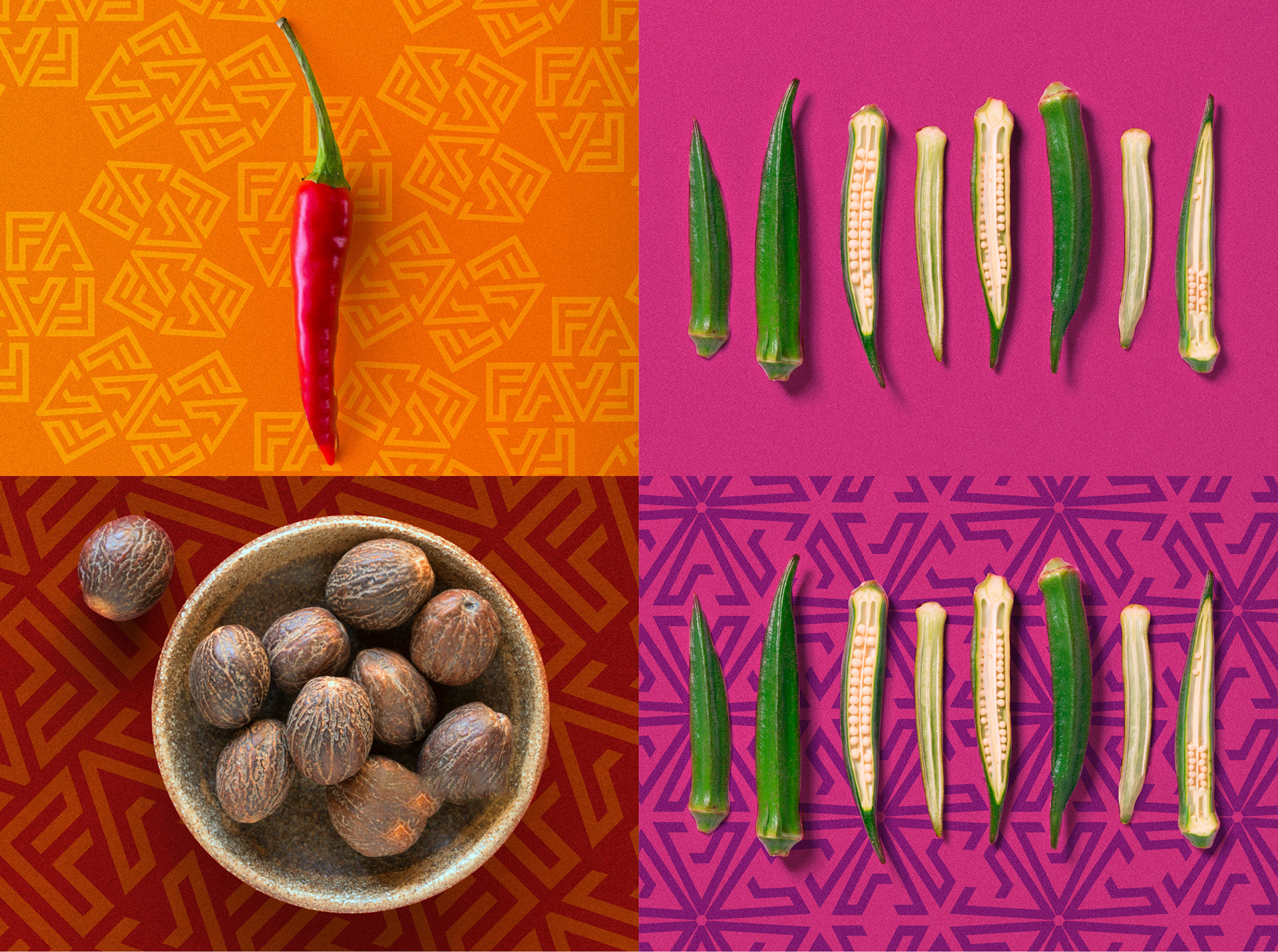
The photographic style for people and ingredients
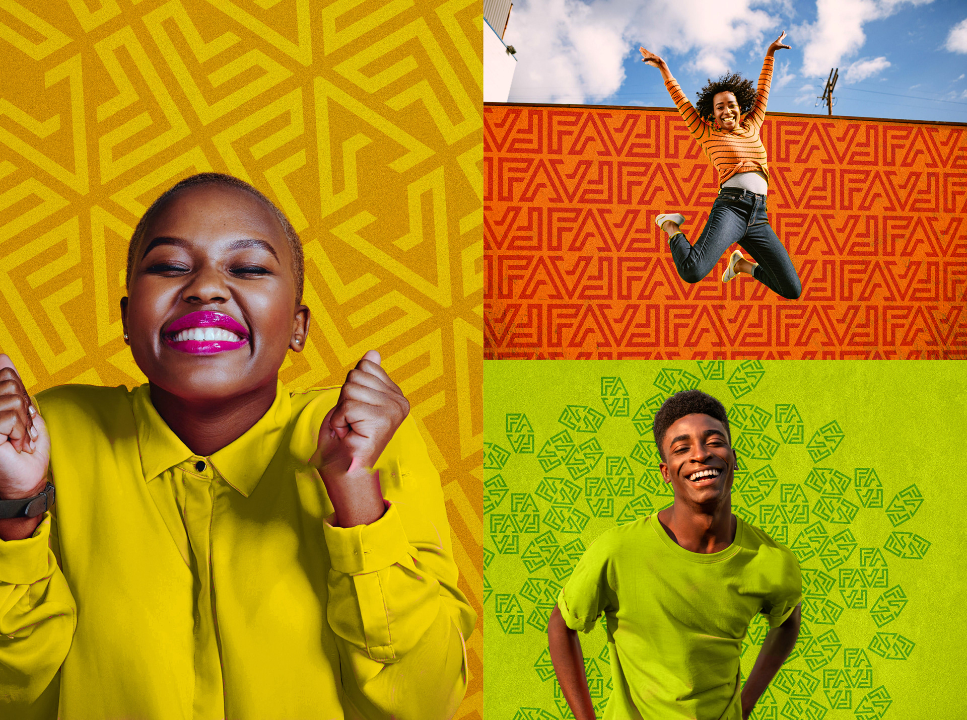
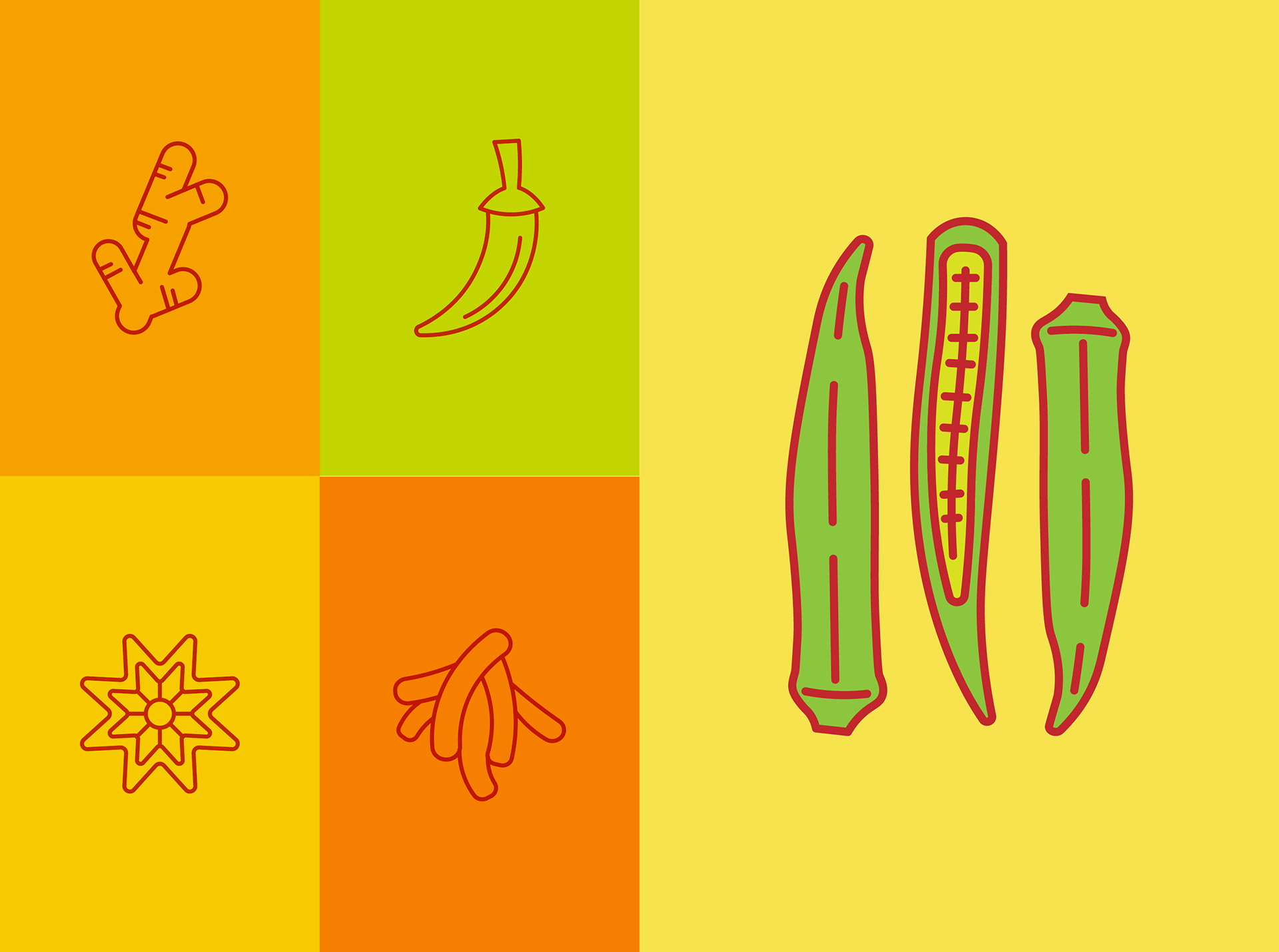
Custom iconography
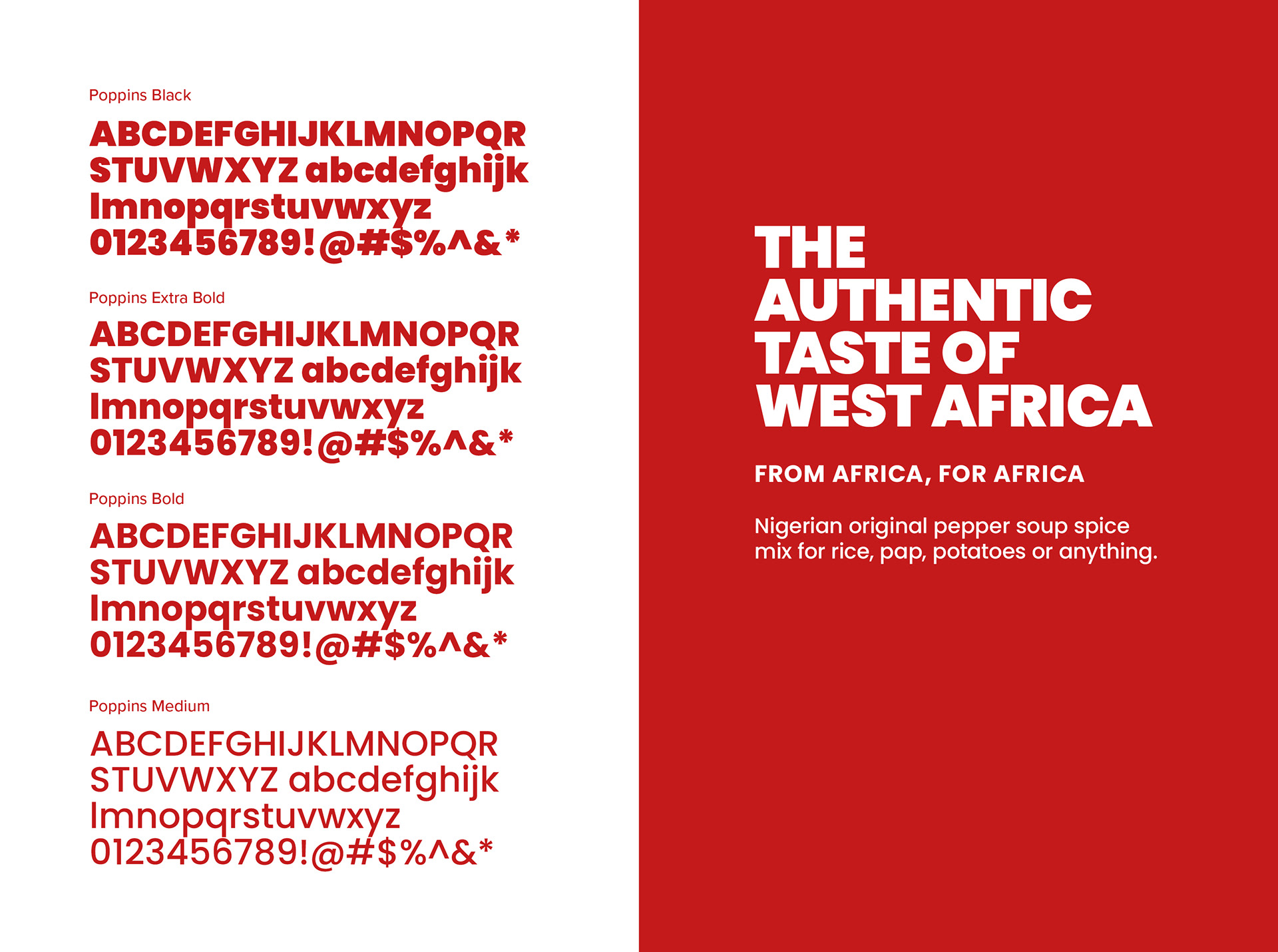
Font selection and typography
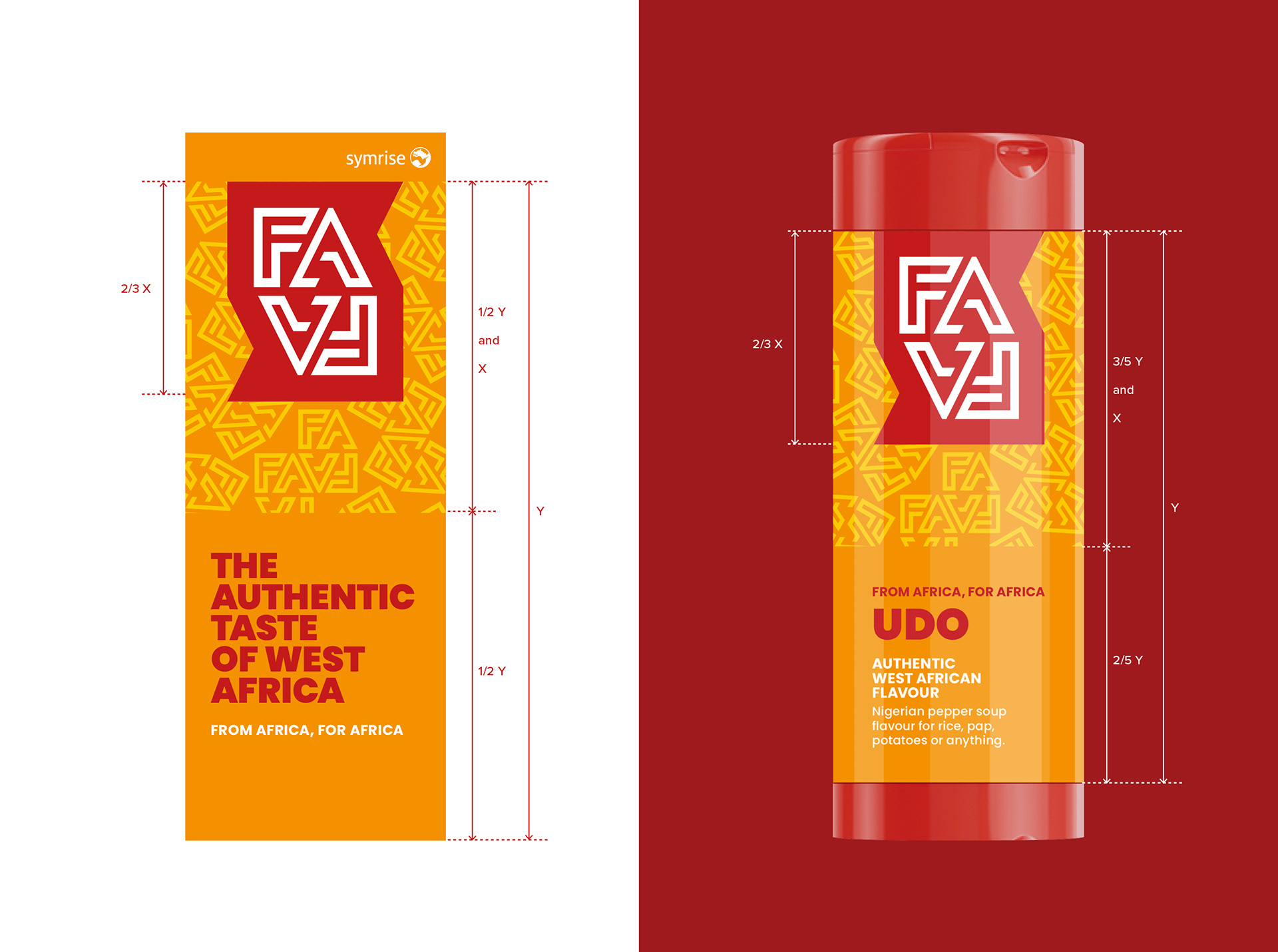
layout construction grid and typographic style – from banner to bottle
produce
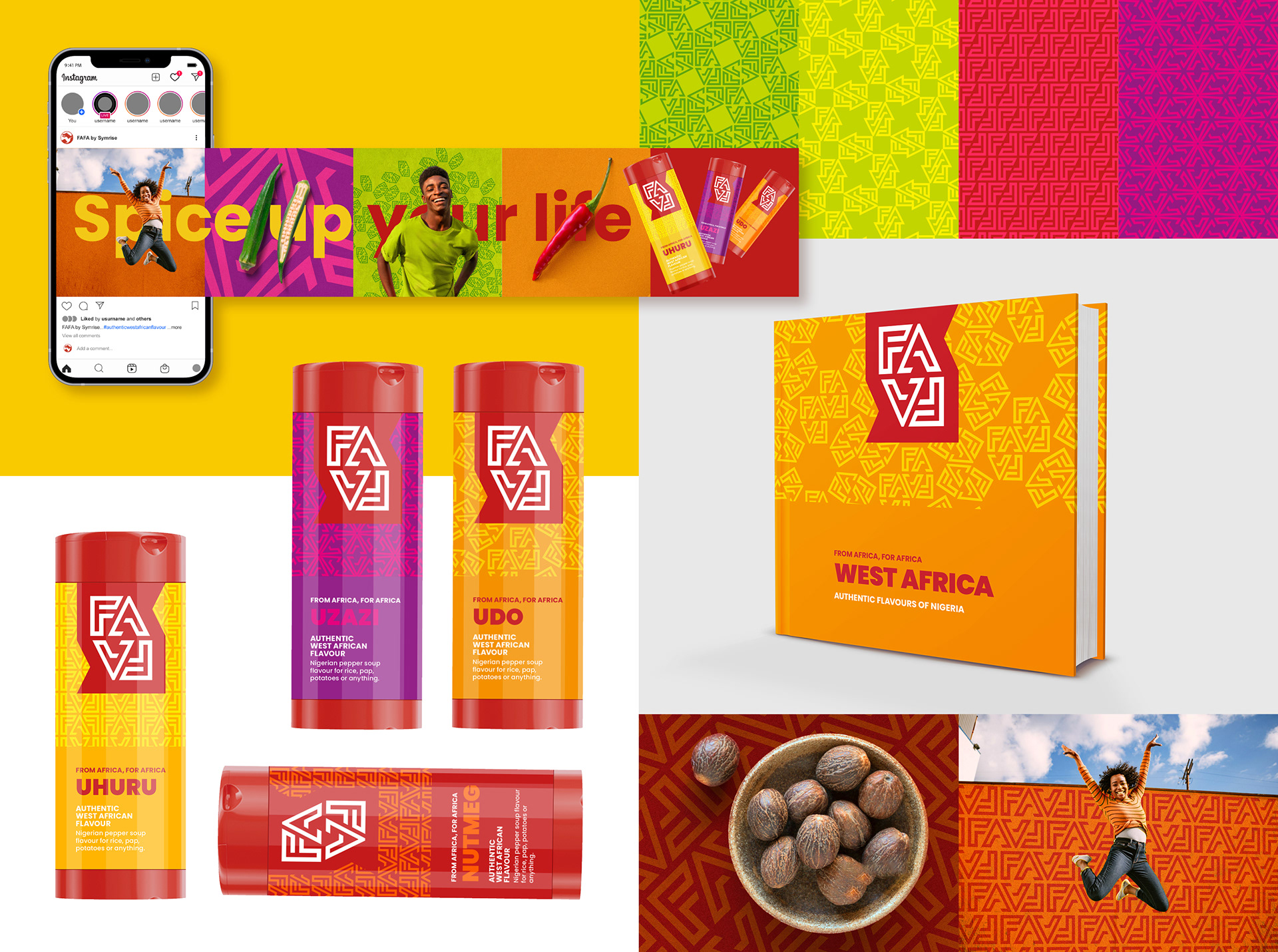
Packaging and Communication
With all the assets of the brand defined, we implemented the visual identity across key physical applications such as shaker packaging across 8 variants, refill pouches, trade sampler boxes, a guidelines manual and event merchandise such as pull-up banners.
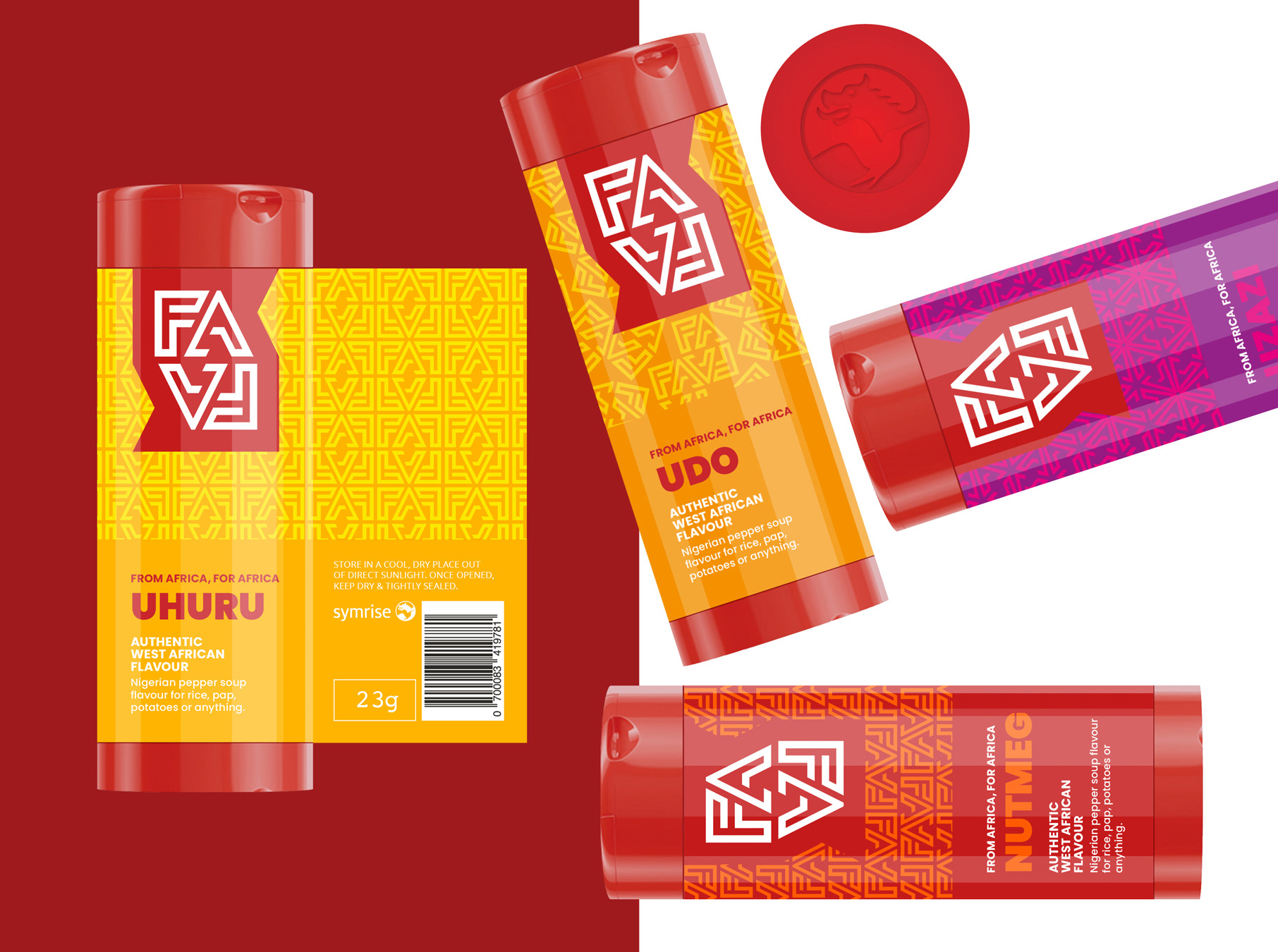
SHAKER PACKAGING DESIGN
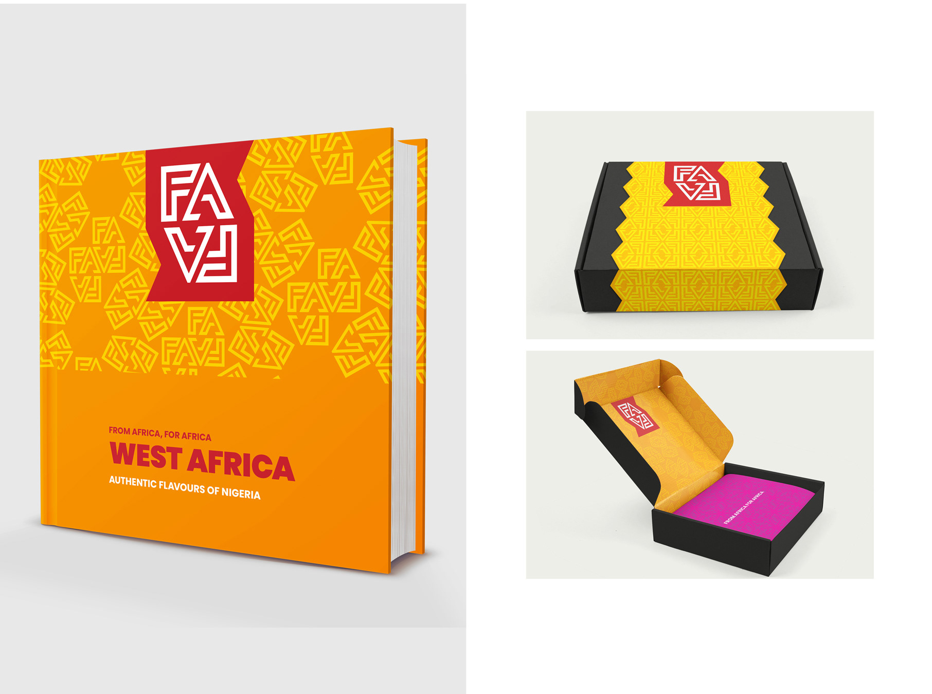
BRAND GUIDELINES AND SAMPLER PACKAGING
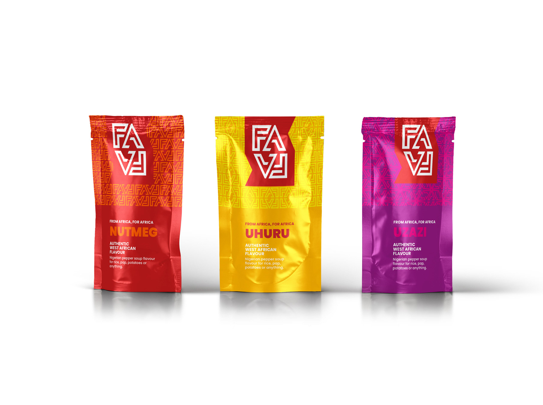
REFILL PACKAGING
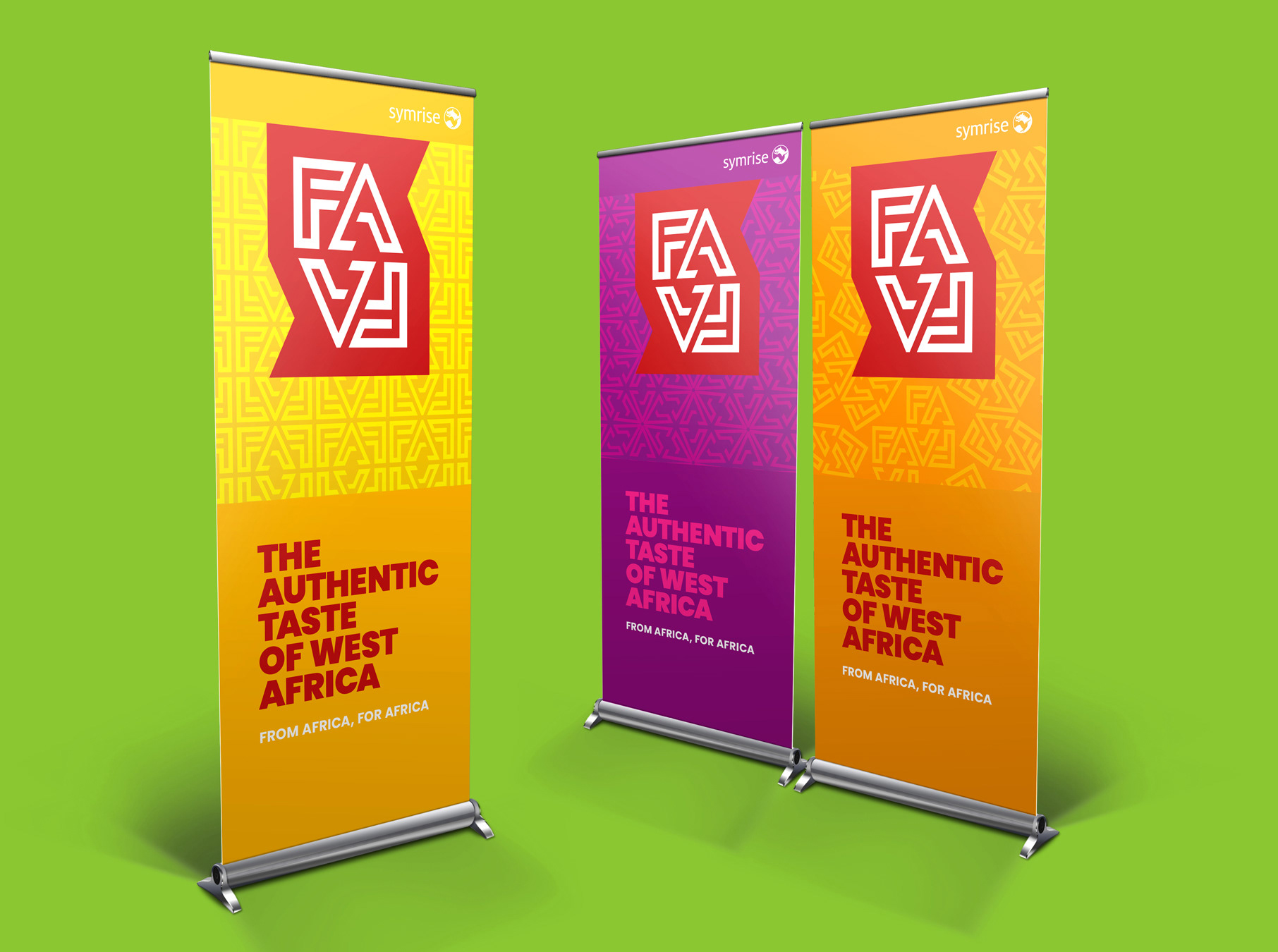
PULL-UP BANNERS
produce
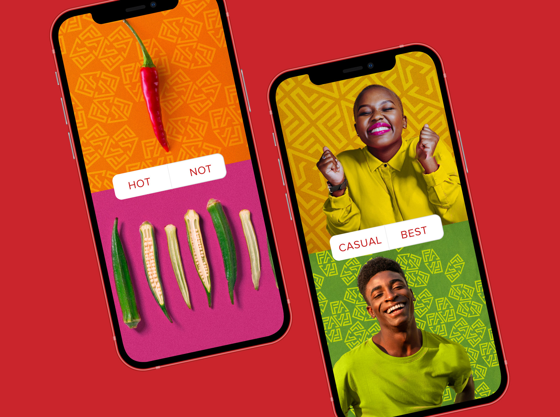
Digital Applications
Digital applications were brought to life on social media in a variety of formats. Here we made full use of the ingredients and people photography, typographic style and packaging shots to build out cohesive and engaging content.
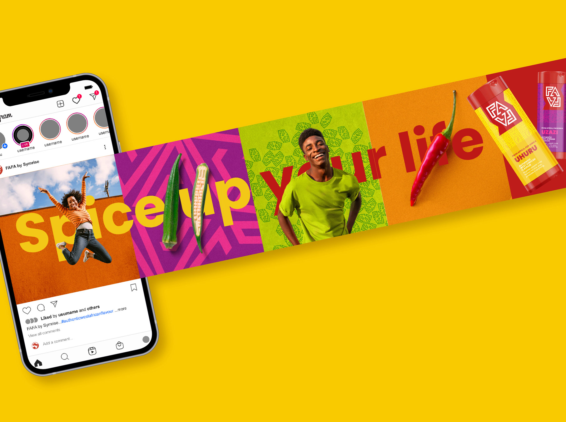
SOCIAL MEDIA CAROUSEL
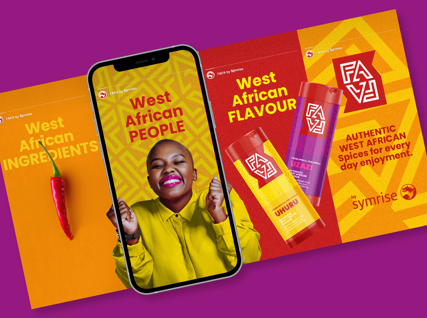
SOCIAL MEDIA STORIES